My mum runs a small business from her home where she makes and sells homemade greetings cards. She wanted to have an online presence, and as a gift, I designed her a logo that could be printed on cards and sent with orders, or given out at craft fairs. Her name is Sheila, so the name of the company is simply ‘Sheila’s Cards’.
I didn’t spend long doodling some sketches before I came up with the idea of making the letter ‘S’ into the shape of a card standing up (fig 1). Once I’d got the general idea, it all fell into place quite quickly. I chose to use the colour pink and floral pattern for the cover of the card as most of the people who would be buying her cards would be female. I felt that this would have an appeal to them. For the background, I used a pastel shade of blue as I felt this complemented the pink cover. I had some of the flowers floating off the ‘S’ to represent the handcrafted nature of the cards she produces.
Fig 1: Sheila’s Cards logo
There was not much of a consultation on the logo. It was one of those moments when everything came together very quickly, and everyone was happy with how it looked. However, I have come to realise that perhaps some consultation with the client would have been helpful to the process to understand their expectations. In this case, though, the work without much discussion was acceptable as I had a personal relationship with the client and I knew what she wanted.
Once the logo was agreed on, I put together some contact details to make a business card which could be passed along with orders. For this, I made some small icons to go with the various forms of communication and chose a handwritten style font. The result can be seen below (fig 2).
Fig 2: Sheila’s Cards visiting/business cards, front and back
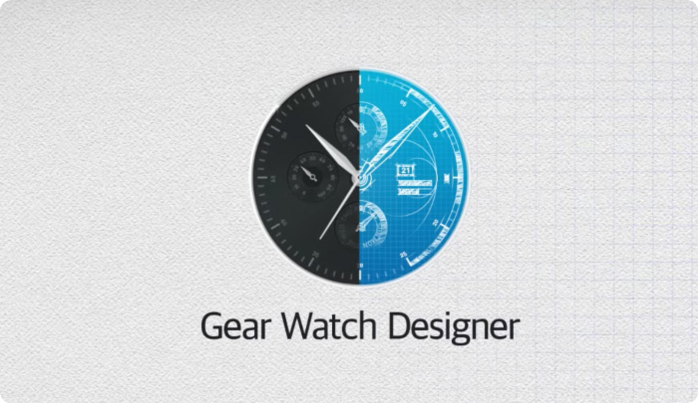
With the advent of smartwatches, there is now the opportunity for owners of the Samsung Gear range of watches to design their own faces, either for personal use or to sell on the Samsung store.
Watches are put together using the software ‘Gear Watch Designer’ (Samsung, 2017) available for both Windows and Mac OS. This software is in beta testing so has a lot of bugs, but provides one of the best ways for designers with little or no programming skills to make a functioning watch face.
Designs can be made using the stock image provided with the GWD software, or by making your own graphics using popular design software such as Photoshop or Illustrator.
I have been designing watch faces for about a year now, and as the software develops, so the designs can become more involved. To keep my watches on a theme I first ‘established’ a brand name and designed a logo that I could use on all the different faces I made. The name I decided on was ‘Himalayan’ (fig 1). The main icon is the letter ‘H’ with the cross-section made to look like mountains.
Fig 1: Himalayan Watches logo
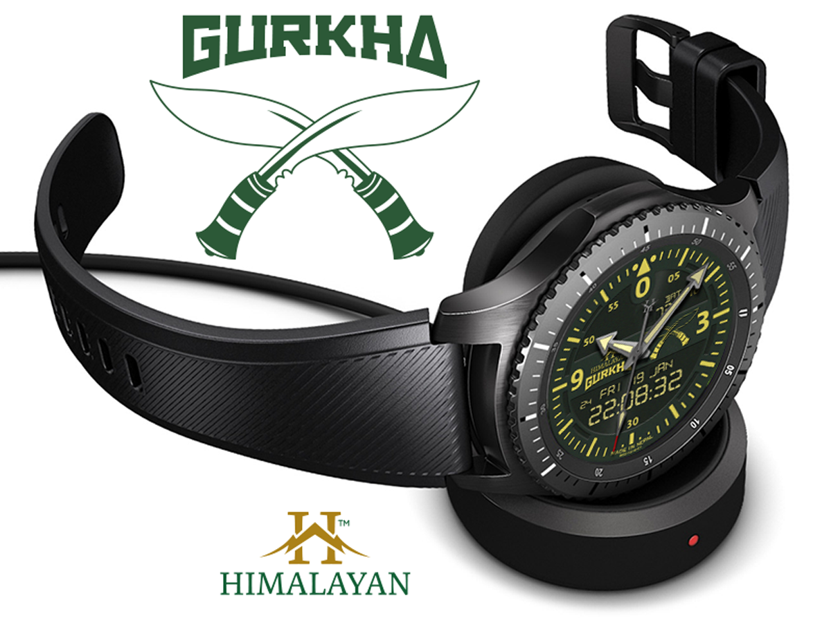
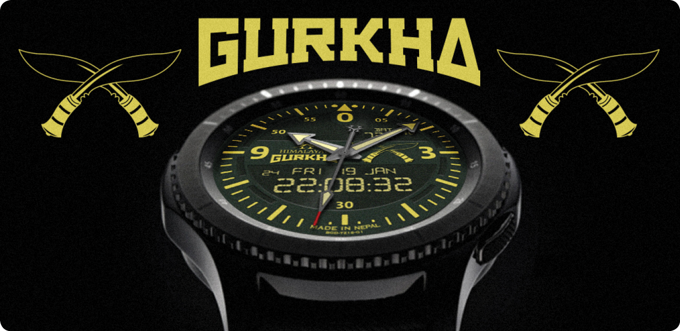
With this brand established I could then make some different faces and give them appropriate titles. The first was called the ‘Gurkha’ (fig 2). I again made a logo for this title to go with the ‘Himalayan’ title already established. Using Illustrator, I made a line art drawing of the traditional Gurkha weapon, the khukuri knife.
Fig 2: Himalayan Gurkha Digital displayed on the Samsung Gear S3 Frontier
Each element of the watch had to be made individually, from the background, the dial numbers, dial index, and the hands. Each hand also has a shadow that needs to act accordingly. I then decided to make the watch a dual analogue and digital face. I didn’t want the standard LCD font for this though and made my own slightly more elaborate version.
As with all design jobs, this is an ongoing project where I can tweak specific design elements to my liking. This version of the ‘Gurkha’ will be going on sale in the Samsung store early in 2018.
My next project will be called the ‘Sherpa’, and this face, while looking similar, will offer step counts and altitude readings, making it the perfect companion for the trekker heading off to Everest Base Camp! Instead of having an image of khukuri knives, these will be replaced by two ice-picks used in mountain climbing.
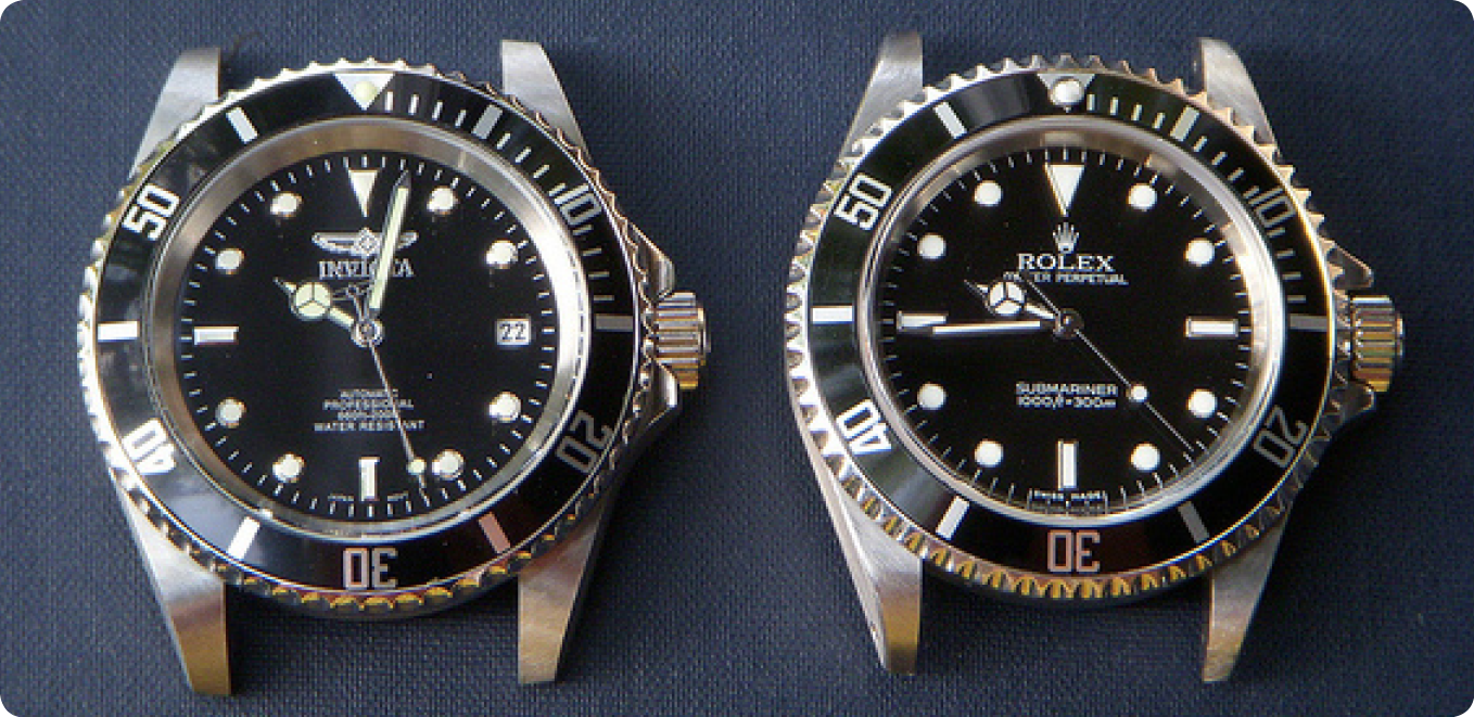
There are many inspirations in the world of real watches, and recently on Facebook groups set up for users of these watches (Facebook, 2017), there have been many heated discussions about what constitutes copyright infringement on a watch face. For instance, could a world-renowned company such as Rolex (Rolex, 2017), claim copyright on a bezel that is green and uses a particular font? (fig 3).
Fig 3: The Rolex Submariner with its distinctive green bezel and face.
Some would argue that a) you can’t copyright a colour, and b) there are so many different watch brands that already use this style of bezel without seemingly infringing copyright (fig 4). As one blogger reflects, Rolex might have a hard time proving that a similar watch from another brand with a different name on the dial would be confused with a Rolex given the now almost generic nature of the Submariner design. (ablogtowatch.com, 2014).
Fig 4: The Invicta watch (left) and the Rolex (right) are almost identical.
What about the logo for the Omega watch company? They use the greek symbol for omega ‘Ώ’. If this were used without the word ‘Omega’ present, could it be sold as copyright infringement of a logo? CAN you copyright what is basically a letter?
As more and more smartwatch watch face designers ‘borrow’ from the real world of watches, this debate will inevitably roll on.
In 2015 I had the opportunity to do a job for the World Health Organisation (South East Asia Regional Office). Initially, they were using a design firm based in India to put together a series of manuals for a Sanitation Safety Planning workshop. However, the quality of the design was unacceptable for the client, and I took over the design of a tri-fold A4 brochure, and then the covers for the manuals (for consistency of design).
The original design firm had produced a graphic showing the process of managing water quality risks, but it looked amateur and cluttered (fig 1). While the process was relatively complicated, the client wanted to see a clear and attractive diagram that could be used in the brochure, on the covers for the manuals and also in PowerPoint presentations.
Fig 1: Original flow diagram
My idea was to make each process appear in the style of a hexagon linear flow diagram, emulating the scientific nature of the solution. The client also wanted each element to be separate so that they could swap and change as needed for different PowerPoint slides. Due to this, the final image was not exactly as I would have liked it (fig 2), but was helpful for the client (final used image fig 3). Having seen what the first design firm came up with, the client had already made the decision to remove the text where it was highlighting the various problems that one might encounter in the various processes of water treatment.
Fig 2: Concept water management flow diagram
Fig 3: Final water management flow diagram
After completing the design for the flow diagram, I started to put the copy together for the tri-fold brochure. For the bullet-points, I used hexagons to keep the general design tied together. I followed the WHO branding guidelines, which at times were conflicting and confusing, but along with the client, we managed to overcome any issues.
The brochure included case studies, parts of which were to be linked to the bullet-points. To visualise this, I introduced different colours highlighting the relevant text. I might have used arrows linking the various texts, but I felt that this looked cluttered and messy, and wasn’t in keeping with the clean design approach we had taken.
On the inside the client wanted a chart which showed the growth of the number of water safety plans in both the rural and urban setting from 2011 to 2016. I wanted these to reflect the size so in consultation with the client we made each circle indicate the change in numbers in the circumference of the rings (fig 4).
Overall, the client was delighted with the outcome of the brochure, and the covers for the manuals helped to keep a consistent look to the whole project. On reflection, I would have liked to use the version of the flow diagram in fig 2. The limitations of the client wanting to move the icons around meant that we went with that in fig 3, but maybe with some further experimentation we could have made something that was visually better, but that had more flexibility.