Janajagaran Cards Mockup

Nepali Political Party Visiting Cards

Janajagaran Cards Mockup

Yesterday in the Kathmandu valley it was election day. Earlier this year I designed some new business cards for the Nepali political party ‘Janajagaran’ (which means public awareness).

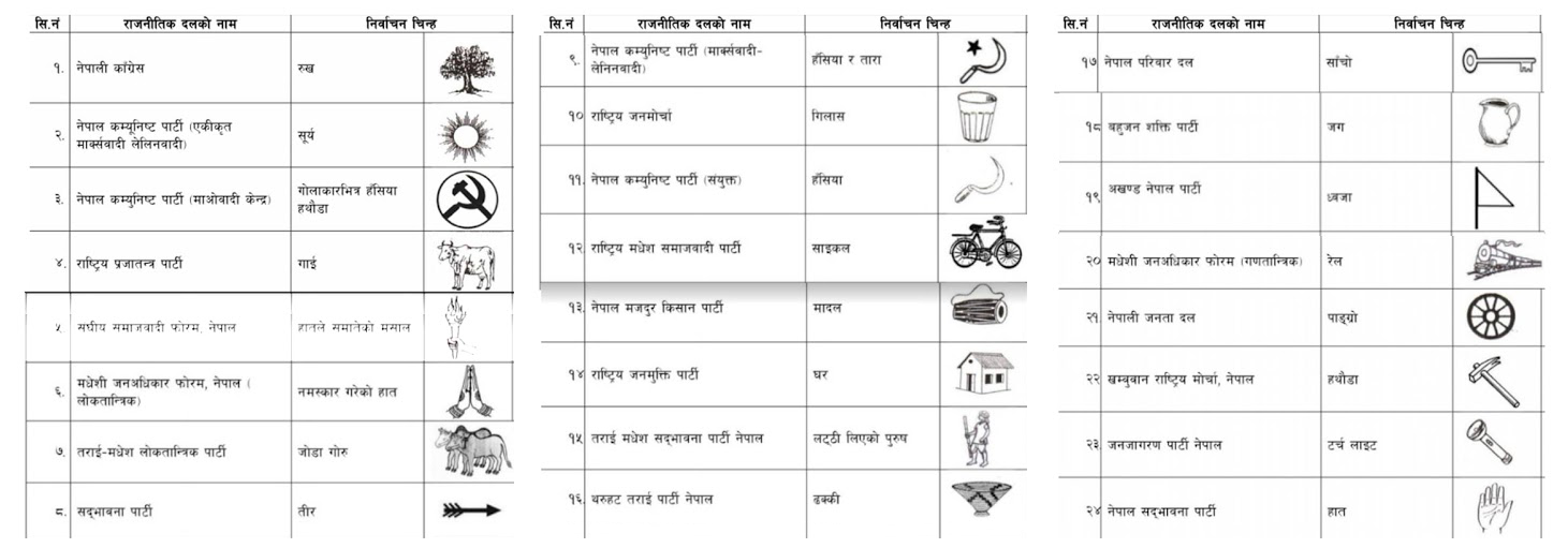
In Nepal, each prospective party is designated an election symbol as a way to help people identify the candidate that they want to vote for (not all voters will be able to read well enough to find the party they intend to vote for, and there are usually over 20 parties listed). The symbol for Nepali Congress is a tree, while CPN-UML has a sun, and CPN-Maoist Centre uses a hammer and sickle. There are many more (fig 1), from a cow to a bike and even a house. The symbol that Janajagaran were given is a torch (fig 2).


Nepali-Election-Marks
Fig 1: A list of Nepali political parties and their election symbols for the 2017 election.


Election-Mark
Fig 2: Janajagaran Party election mark.


The ‘logo’ for the Janajagaran party is a flag which consists of a red triangle on top of a split of blue (top) and green (bottom). Inside the triangle are seven six-pointed stars representing the seven issues that the party stand for.

Recently having looked at a blog on ‘Top 6 Business Card Trends In 2017’ (Designhill, 2017), I am satisfied that the card I created for the party reflects current patterns in business cards. Some of the listed trends are the simplicity of design, using your brand elements, big typeface, witty puns and symbols, and interactive card design. The article further mentions that the central purpose of business cards is to deliver contact details of the company while also making a lasting impression on the client. These were both crucial for the business card of Janajagaran Political Party.

The card undertook the simplicity aspect as it is easily readable and understood by both Nepali and non-Nepali readers. The business card further made sure it had the branding elements of the political party such as the colour, logo and the seven stars.

As the party aims to become a shining light for the country of Nepal, I used the torch, the party’s election mark, as more of a prominent feature and symbol on the card. Generally, the symbol is just included somewhere to inform voters of the party’s mark. In contrary to the general Nepali trend, I had the light coming out of the torch revealing the relevant information including the contact information. At first, I used the two primary colours of the flag and then had drawn a nice clean, modern looking torch to come in from the bottom right, splitting the two colours. However, I later found out that I could not change the style of the torch as this had to be the same as the image assigned to them by the Election Commision. I did re-draw the torch in Illustrator, keeping the style the same to avoid confusion, as the only version available was a poor thumbnail image.

On reflection, I realise that it is crucial for a designer to understand the context of the client and the country, especially if the work involves governmental, political or legal clients. I have learnt that I should always explore such issues with clients beforehand.

The card is in English on one side and Nepali on the other. I was pleased with the final outcome and delighted with how the torch and light effect looks (fig 3).


Janajagaran-Cards-1
Fig 3: Final Janajagaran Party business card (English version).


References:
Designhill, (2017). [Infographic] Top 6 Business Card Trends In 2017. [Online] Available at: http://www.designhill.com/design-blog/top-6-business-card-trends-in-2017/ [Accessed: 8 December 2017]

Fig 1: Namaste Nepal. Local election in Nepal in 2017/2074 (election symbols). [Online] Available at http://write2basukshitiz.blogspot.com/2017/03/local-election-in-nepal-in-20172074.html [Accessed: 8 December 2017]

Life-of-Poverty-Wheel-2016

Fullness of Life

In development work, UMN knows that poverty arises from a complex web of inter-related causes (fig 1). They turned this understanding of poverty on its head and tried to describe its opposite. The result was the fullness of life model. What UMN wanted to show in a simple graphic was how the impacts of actions taken in one area of a person or community’s life flow through into other areas (UMN, 2011).

Life-of-Poverty-Wheel-2016
Fig 1: Life of poverty diagram (UMN, 2011)

In 2011 I was given the task of producing this graphic. I did some research and found that what we were trying to achieve was in a way similar to the Millenium Development Goals (now called the Sustainable Development Goals) (fig 2) that the United Nations had agreed to.

UN Sustainable Development Goals
Fig 2: UN Sustainable Development Goals (UN, 2015)

I liked the idea of having different colours for each goal/area of work, so we chose to use six different colours for each. We didn’t want these to be stand-alone graphics, however, but to all be connected reflecting the complex web of inter-related causes. I merged the colours into each other to show further linkage (fig 3).

In the middle of the whole web there used to be a black button with the logo of UMN and the type “Fullness of life for all”, however on reflection I wanted to show more of how each of the six areas can bring about the fullness of life. In 2016 I updated the graphic slightly, using one of the fonts we had adopted as an organisation, and in the centre, I made a background of bubbles made up of all the different colours and mingling with each other. I removed the UMN logo part of it as whenever it is used the logo accompanies it (either on a poster, in PowerPoint or a document), and I felt that this was no longer necessary.

Fullness-of-Life-Wheel-2016
Fig 3: Fullness of life diagram (UMN, 2011)

This model has proved popular within the organisation for explaining UMN’s fullness of life theory and showing how by changing one thing in someone’s life, other areas can also be positively affected. I have heard since that other NGOs have even referred to it.

After the diagram was finished and we’d had posters printed, I made a PowerPoint presentation for use by anyone that needed to present some or all of UMN’s fullness of life ideas. I saw that the Executive Director had been using one which I felt could be improved upon with some smart features of PowerPoint. To help with this, I made different images highlighting each of the different areas, but had the rest of the diagram fade slightly. It could still be seen, but now it would help focus the audience receiving the presentation onto which area was being discussed (fig 4). There was also a slide which faded from the ‘life of poverty’ model into the ‘fullness of life’ model.

Fullness of Life Presentation
Fig 4: Fullness of Life interactive PowerPoint presentation

This presentation needs to be updated to reflect the latest design (figs 1 & 3), but overall these improvements have made it easier for people to see the interaction between the different areas of the model.

On further reflection, each of the areas might benefit from some a graphic or icon to reflect the chosen subject. This would be more like the Sustainable Development Goals and could help to illustrate the work.


References:
UMN (2011) Fullness of Life model. [Online] Available at: http://www.umn.org.np/our-vision [Accessed: 14 November 2017].

UN (2015) Sustainable Development Goals. [Online] Available at: http://www.un.org/sustainabledevelopment/sustainable-development-goals/ [Accessed: 14 November 2017].