Bijay Poster

Victory!

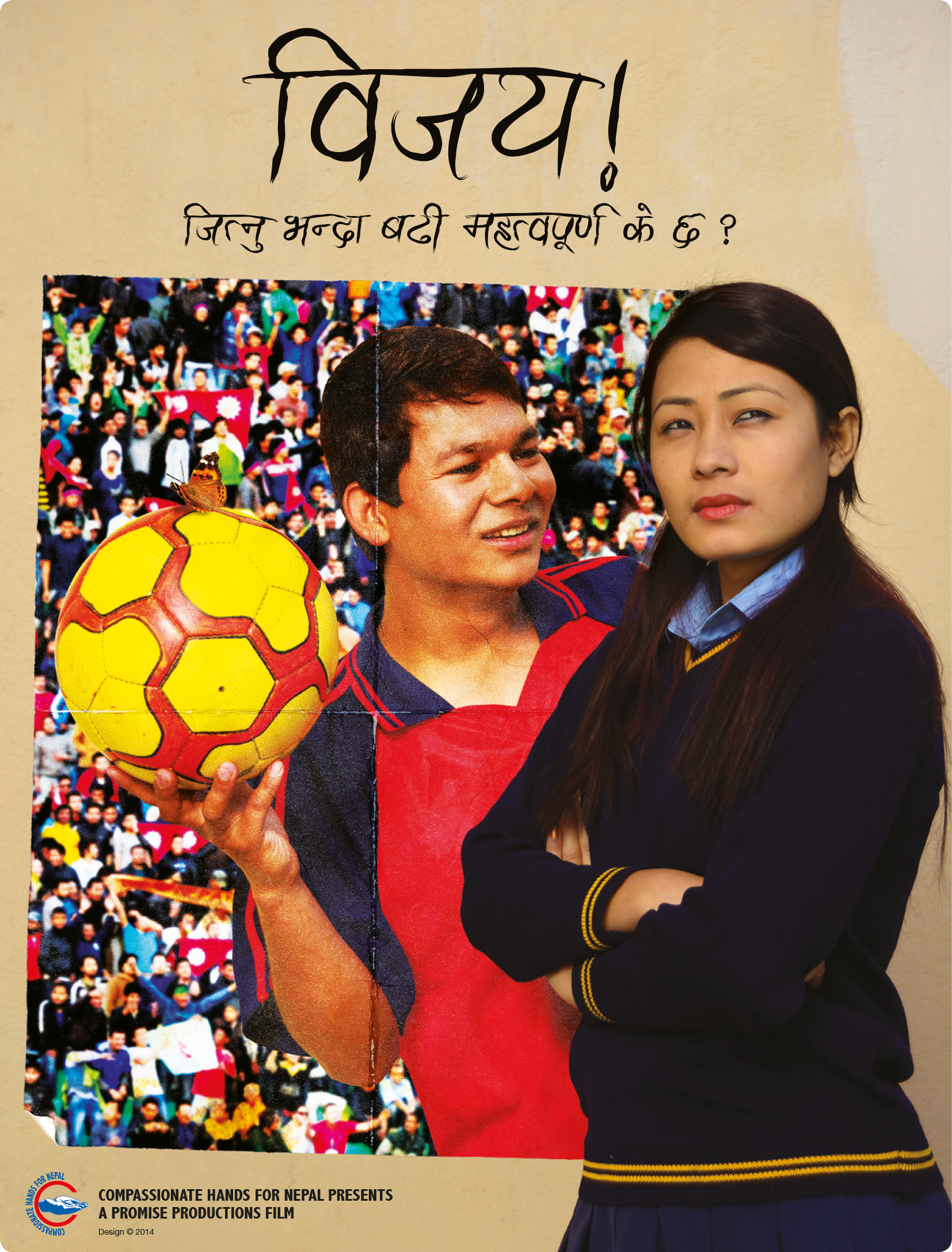
Before I came to Nepal, I worked for a company designing DVD sleeves and point of purchase items for the film industry. So maybe it was only fitting that a few years ago I was approached to create a poster for the Nepali film Bijay! (Bijay, 2014).

To start my research into this film, one of the producers gave me a screening of the movie. The film centres around a teenage boy named Bijay (which means ‘victory’). Bijay is crazy about football and wants to play for Nepal one day. His girlfriend is frustrated that all his attention is on football, and even some of his teammates get annoyed with him when he keeps the ball to himself in games and won’t pass, preferring to take all the glory for himself. This gets worse when some scouts come to see his team play.

There were a few themes from the film that stood out. Firstly, Bijay had a lot of posters of star football players on the wall of his room. He spent a lot of time staring at the posters and dreaming of being a star himself. The second thing that struck me was a scene where he was watching a caterpillar crawl along a wall. Later in the film, he found a cocoon hanging from a branch near the same spot, and then later still Bijay watches the butterfly emerge. These scenes all came at poignant moments and were signifying that to succeed in life (and in love) he needed to change.

There had already been a photoshoot with the actors playing Bijay and his girlfriend, and the producer had an idea of having them both inside the national football stadium. After watching the movie again on my own, I had a plan to use the concept of a poster within the poster. I pitched this to the producer, and he liked how it sounded.

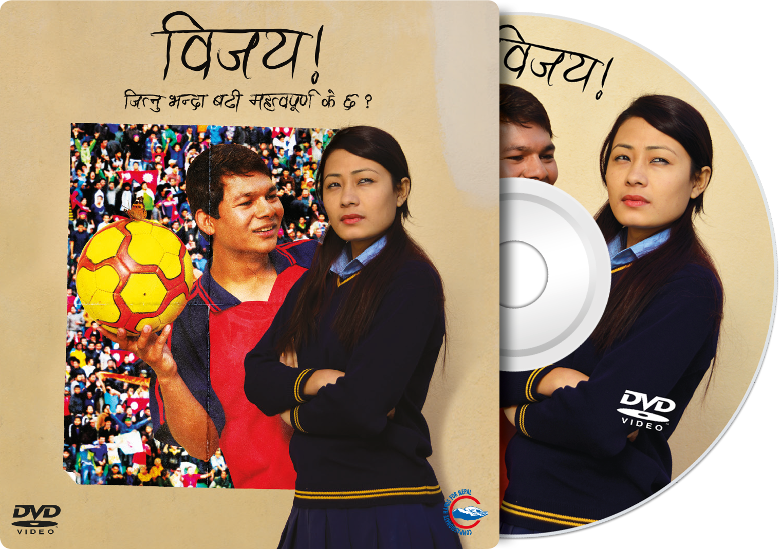
My thought was to use an image that they had taken of Bijay and his girlfriend leaning against a wall. In the picture, Bijay was looking at his girlfriend while she had an annoyed look on her face into the distance. Bijay was in a football kit and holding a football. I chose to frame Bijay into a poster, with the football stadium as a background for it. His girlfriend remained standing against the wall as if separated from him, but also together. As a final touch, I added a butterfly resting on the football. The poster was then given a different lighting effect to the rest of the image and aged to make it look more realistic (fig 1).


Bijay Poster
Fig 1: Final poster for the film Bijay!


The producers were extremely pleased with the outcome. On reflection, I would have liked to have had more control over the photoshoot. The wall that they were leaning against was reasonably dull, and maybe it could have been given more character.

The image was then also used on the DVD sleeve, and I used the unaltered image of Bijay and his girlfriend for the DVD label.
 

Bijay Sleeve
Fig 2: DVD cardboard sleeve and disc for the film Bijay!


References:
Bijay! (2014) Film. Directed by Unknown. [DVD]. Nepal: Promise Productions.

Graphics Standards

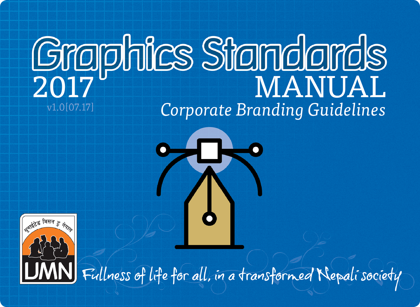
Graphics Standards Manual

Graphics Standards

Back in 2011 when I first designed the UMN logo I put together some creative guidelines. This included advice on how to use the logo, our colours and the use of fonts. The intention was to updat this, but unfortunately, that work never got around to being completed. Earlier this year it became apparent that a much more in-depth and complete guide was needed for use not only by our staff but also by our partners.

While working on a partner profile book which listed the 46 partners who work with UMN, one of their logos surprised me. They had updated it sometime in the last couple of years, and it was using the two colours of UMN, blue and orange, and had five silhouetted figures sitting around talking. This image had been directly copied from our logo and used. The immediate concern I had was that some people would become confused when seeing this logo and might think it was directly something to do with UMN, rather than being a separate NGO. The problem was dealt with quickly, and I offered my services to design them a new logo which would be unique to them.

This then hurried along the plans to produce a new set of guidelines. I did not want these to only cover the use of our logo, however, but to cover all aspects of our creative needs.

We have called the guide ‘Graphics Standards Manual: Corporate Branding Guidelines’. However, on recent reflection and through the reading I have been doing on branding for nonprofit organisations in my annotated bibliography, I have come to realise that we should possibly drop the line ‘Corporate Branding Guidelines’. An organisation’s brand is much more than merely a logo, some fonts and a few colours. As Ritchie & Swami & Weinberg state, “Branding has evolved from humble beginnings as an extension of product packaging to its current status as a key component of organisational strategy.” (Ritchie & Swami & Weinberg, 1999). While this manual is intended to be a comprehensive guide on how to present UMN, the branding of the organisation is something much more substantial, involving mission, vision, values and strategy. As such we will consider the appropriateness of using this line.

Before beginning to compile a new set of guidelines I did some research on manuals that other organisations have produced. Content Harmony (contentharmony.com, no date) have some great ideas. They list 36 great examples of some brands that are doing it right. In almost all of them, the thing that is noticeable is that they all look simple. The KISS technique (Keep It Simple, Stupid) is essential to helping others to follow the way you intend your graphics to be used.

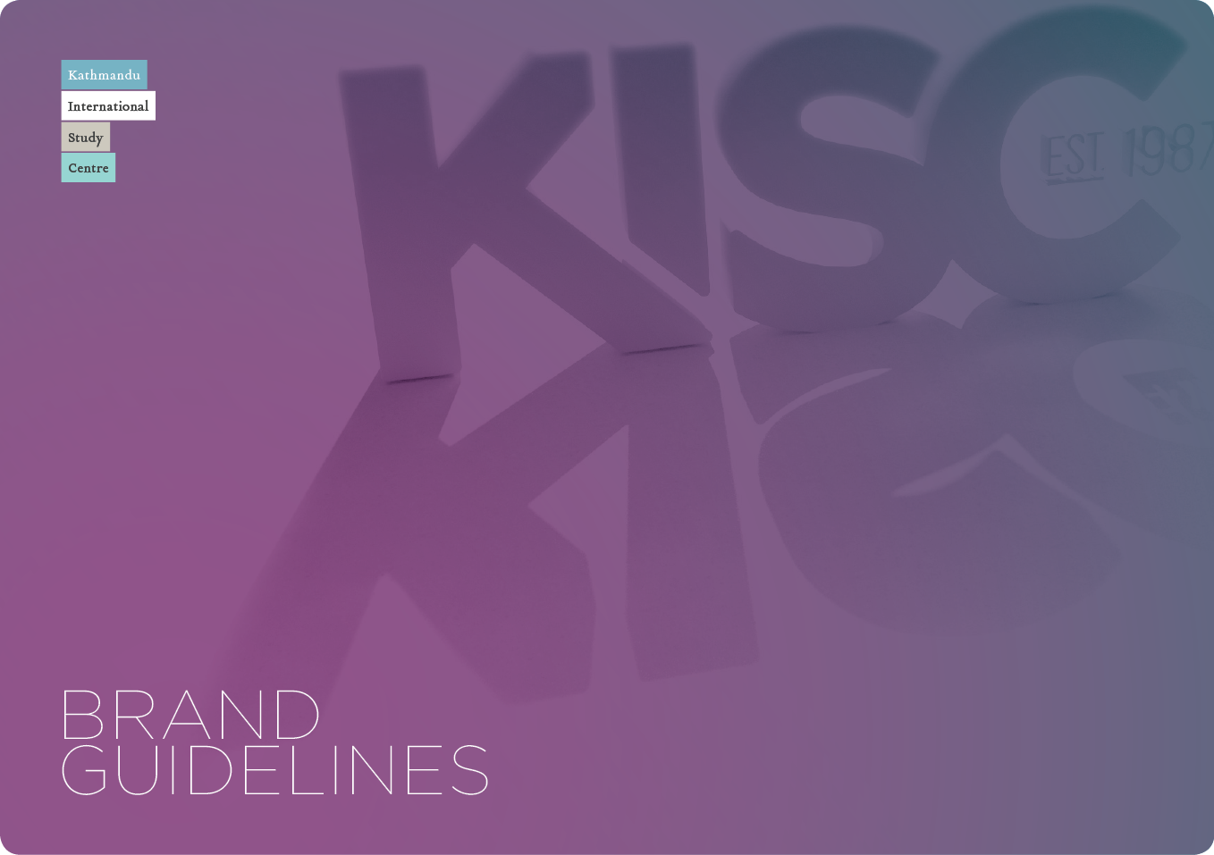
In 2010, graphic designer Matt Watson redesigned the logo and school crest for the Kathmandu International Study Centre in Nepal (KISC, 2010). He also put together a brand guidelines document which is still in use today (figs 1 & 2). His guide makes using KISC graphics very simple for anyone. A designer could be sent this and immediately be able to put together any document which would instantly be recognisable as a KISC branded item.


Graphics Standards4
Fig 1: KISC Brand Guidelines


Graphics Standards5
Fig 2: KISC Brand Guidelines


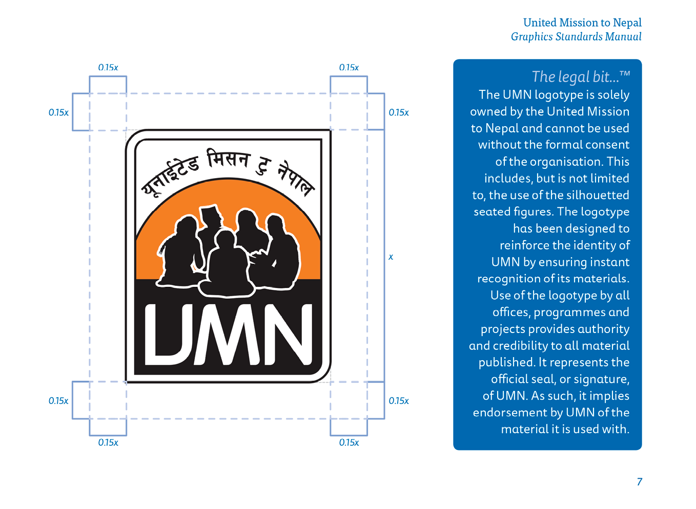
In creating our own Graphics Standards Manual, I have tried to emulate this. I have also included some small paragraphs explaining what a logotype is, what it is used for and why it is essential to use it correctly, and the same for the use of fonts and colours.


Graphics Standards2
Fig 3: Use of the UMN logotype from ‘Graphics Standards Manual’


Graphics Standards3
Fig 4: Use of the UMN vision & vine line from ‘Graphics Standards Manual’


At the beginning of the year, we discovered that many staff within UMN had set up an electronic signature on their emails. Unfortunately, many people did not follow the guide we had set out to do this. Some were using multiple fonts, colours and size of text within the same signature. We decided that we needed to have a uniformity about our emails, and with the help of the Information Technology Services Team and one of my colleagues in the Communications Team, we designed a beautiful looking signature which could be generated by visiting a link to our website (UMN, 2017). The user just needed to fill out their relevant details such as name, job title and email address, then select the team they worked in from a drop-down menu. Other options such as mobile number and desk extension were optional, and once all was filled out, they merely had to click on the generate button and copy and paste the signature that appeared into the email client of their choice. This has helped to bring cohesion to the message that is coming out of UMN.

We hope that this manual will not only help to make sure everything coming out of UMN looks the same, but will also help to strengthen the brand image of the organisation. The manual will be an ongoing project and will include templates for Microsoft Word documents, PowerPoint presentations and an Image Policy.

As the maxim goes, “It is not what you say, it’s how you say it.”


References:
contentharmony.com, (no date) 36 great brand guidelines examples. [Online] Available at: https://www.contentharmony.com/blog/great-brand-guidelines/ [Accessed: 10 December 2017]

KISC, (2010) Kathmandu International Study Centre. [Online] Available at: https://www.kisc.edu.np/ [Accessed: 10 December 2017]

Ritchie, R. J. B., Swami, S. & Weinberg, C. B. (1999) ‘A brand new world for nonprofits’, International Journal of Nonprofit and Voluntary Sector Marketing, 4(1), p. 26.

UMN, (2017) United Mission to Nepal email signature. [Online] Available at: http://www.umn.org.np/signature [Accessed: 10 December 2017]

Janajagaran Cards Mockup

Nepali Political Party Visiting Cards

Janajagaran Cards Mockup

Yesterday in the Kathmandu valley it was election day. Earlier this year I designed some new business cards for the Nepali political party ‘Janajagaran’ (which means public awareness).

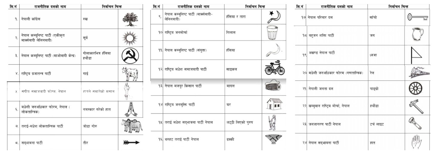
In Nepal, each prospective party is designated an election symbol as a way to help people identify the candidate that they want to vote for (not all voters will be able to read well enough to find the party they intend to vote for, and there are usually over 20 parties listed). The symbol for Nepali Congress is a tree, while CPN-UML has a sun, and CPN-Maoist Centre uses a hammer and sickle. There are many more (fig 1), from a cow to a bike and even a house. The symbol that Janajagaran were given is a torch (fig 2).


Nepali-Election-Marks
Fig 1: A list of Nepali political parties and their election symbols for the 2017 election.


Election-Mark
Fig 2: Janajagaran Party election mark.


The ‘logo’ for the Janajagaran party is a flag which consists of a red triangle on top of a split of blue (top) and green (bottom). Inside the triangle are seven six-pointed stars representing the seven issues that the party stand for.

Recently having looked at a blog on ‘Top 6 Business Card Trends In 2017’ (Designhill, 2017), I am satisfied that the card I created for the party reflects current patterns in business cards. Some of the listed trends are the simplicity of design, using your brand elements, big typeface, witty puns and symbols, and interactive card design. The article further mentions that the central purpose of business cards is to deliver contact details of the company while also making a lasting impression on the client. These were both crucial for the business card of Janajagaran Political Party.

The card undertook the simplicity aspect as it is easily readable and understood by both Nepali and non-Nepali readers. The business card further made sure it had the branding elements of the political party such as the colour, logo and the seven stars.

As the party aims to become a shining light for the country of Nepal, I used the torch, the party’s election mark, as more of a prominent feature and symbol on the card. Generally, the symbol is just included somewhere to inform voters of the party’s mark. In contrary to the general Nepali trend, I had the light coming out of the torch revealing the relevant information including the contact information. At first, I used the two primary colours of the flag and then had drawn a nice clean, modern looking torch to come in from the bottom right, splitting the two colours. However, I later found out that I could not change the style of the torch as this had to be the same as the image assigned to them by the Election Commision. I did re-draw the torch in Illustrator, keeping the style the same to avoid confusion, as the only version available was a poor thumbnail image.

On reflection, I realise that it is crucial for a designer to understand the context of the client and the country, especially if the work involves governmental, political or legal clients. I have learnt that I should always explore such issues with clients beforehand.

The card is in English on one side and Nepali on the other. I was pleased with the final outcome and delighted with how the torch and light effect looks (fig 3).


Janajagaran-Cards-1
Fig 3: Final Janajagaran Party business card (English version).


References:
Designhill, (2017). [Infographic] Top 6 Business Card Trends In 2017. [Online] Available at: http://www.designhill.com/design-blog/top-6-business-card-trends-in-2017/ [Accessed: 8 December 2017]

Fig 1: Namaste Nepal. Local election in Nepal in 2017/2074 (election symbols). [Online] Available at http://write2basukshitiz.blogspot.com/2017/03/local-election-in-nepal-in-20172074.html [Accessed: 8 December 2017]

Life-of-Poverty-Wheel-2016

Fullness of Life

In development work, UMN knows that poverty arises from a complex web of inter-related causes (fig 1). They turned this understanding of poverty on its head and tried to describe its opposite. The result was the fullness of life model. What UMN wanted to show in a simple graphic was how the impacts of actions taken in one area of a person or community’s life flow through into other areas (UMN, 2011).

Life-of-Poverty-Wheel-2016
Fig 1: Life of poverty diagram (UMN, 2011)

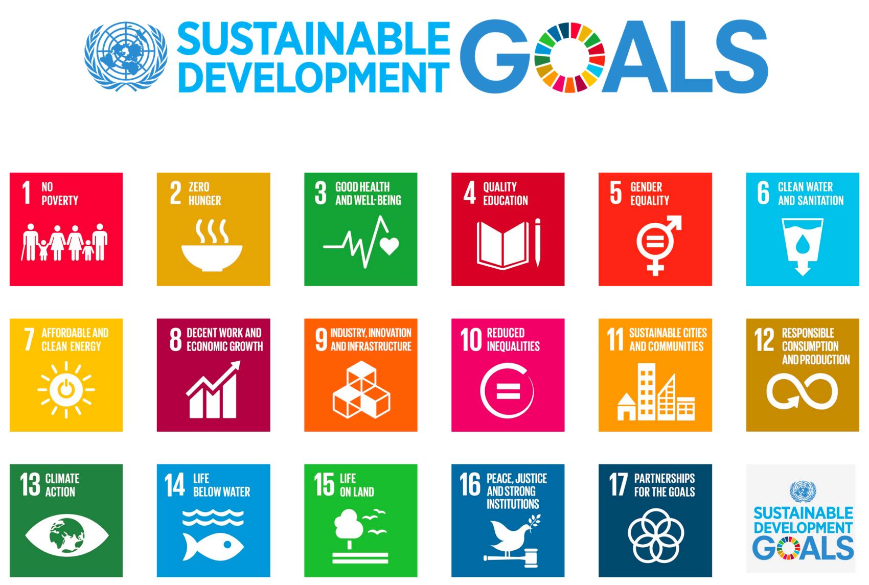
In 2011 I was given the task of producing this graphic. I did some research and found that what we were trying to achieve was in a way similar to the Millenium Development Goals (now called the Sustainable Development Goals) (fig 2) that the United Nations had agreed to.

UN Sustainable Development Goals
Fig 2: UN Sustainable Development Goals (UN, 2015)

I liked the idea of having different colours for each goal/area of work, so we chose to use six different colours for each. We didn’t want these to be stand-alone graphics, however, but to all be connected reflecting the complex web of inter-related causes. I merged the colours into each other to show further linkage (fig 3).

In the middle of the whole web there used to be a black button with the logo of UMN and the type “Fullness of life for all”, however on reflection I wanted to show more of how each of the six areas can bring about the fullness of life. In 2016 I updated the graphic slightly, using one of the fonts we had adopted as an organisation, and in the centre, I made a background of bubbles made up of all the different colours and mingling with each other. I removed the UMN logo part of it as whenever it is used the logo accompanies it (either on a poster, in PowerPoint or a document), and I felt that this was no longer necessary.

Fullness-of-Life-Wheel-2016
Fig 3: Fullness of life diagram (UMN, 2011)

This model has proved popular within the organisation for explaining UMN’s fullness of life theory and showing how by changing one thing in someone’s life, other areas can also be positively affected. I have heard since that other NGOs have even referred to it.

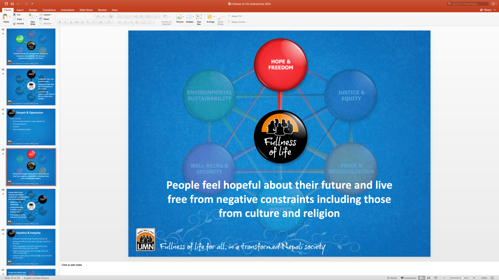
After the diagram was finished and we’d had posters printed, I made a PowerPoint presentation for use by anyone that needed to present some or all of UMN’s fullness of life ideas. I saw that the Executive Director had been using one which I felt could be improved upon with some smart features of PowerPoint. To help with this, I made different images highlighting each of the different areas, but had the rest of the diagram fade slightly. It could still be seen, but now it would help focus the audience receiving the presentation onto which area was being discussed (fig 4). There was also a slide which faded from the ‘life of poverty’ model into the ‘fullness of life’ model.

Fullness of Life Presentation
Fig 4: Fullness of Life interactive PowerPoint presentation

This presentation needs to be updated to reflect the latest design (figs 1 & 3), but overall these improvements have made it easier for people to see the interaction between the different areas of the model.

On further reflection, each of the areas might benefit from some a graphic or icon to reflect the chosen subject. This would be more like the Sustainable Development Goals and could help to illustrate the work.


References:
UMN (2011) Fullness of Life model. [Online] Available at: http://www.umn.org.np/our-vision [Accessed: 14 November 2017].

UN (2015) Sustainable Development Goals. [Online] Available at: http://www.un.org/sustainabledevelopment/sustainable-development-goals/ [Accessed: 14 November 2017].

Sheila's Cards

Crafty Little Logo

My mum runs a small business from her home where she makes and sells homemade greetings cards. She wanted to have an online presence, and as a gift, I designed her a logo that could be printed on cards and sent with orders, or given out at craft fairs. Her name is Sheila, so the name of the company is simply ‘Sheila’s Cards’.

I didn’t spend long doodling some sketches before I came up with the idea of making the letter ‘S’ into the shape of a card standing up (fig 1). Once I’d got the general idea, it all fell into place quite quickly. I chose to use the colour pink and floral pattern for the cover of the card as most of the people who would be buying her cards would be female. I felt that this would have an appeal to them. For the background, I used a pastel shade of blue as I felt this complemented the pink cover. I had some of the flowers floating off the ‘S’ to represent the handcrafted nature of the cards she produces.


Sheila's Cards
Fig 1: Sheila’s Cards logo


There was not much of a consultation on the logo. It was one of those moments when everything came together very quickly, and everyone was happy with how it looked. However, I have come to realise that perhaps some consultation with the client would have been helpful to the process to understand their expectations. In this case, though, the work without much discussion was acceptable as I had a personal relationship with the client and I knew what she wanted.

Once the logo was agreed on, I put together some contact details to make a business card which could be passed along with orders. For this, I made some small icons to go with the various forms of communication and chose a handwritten style font. The result can be seen below (fig 2).

Sheila's Cards2


Sheila's Cards3
Fig 2: Sheila’s Cards visiting/business cards, front and back
Gear Watch Designer

Watch Face Design

Gear Watch Designer

With the advent of smartwatches, there is now the opportunity for owners of the Samsung Gear range of watches to design their own faces, either for personal use or to sell on the Samsung store.

Watches are put together using the software ‘Gear Watch Designer’ (Samsung, 2017) available for both Windows and Mac OS. This software is in beta testing so has a lot of bugs, but provides one of the best ways for designers with little or no programming skills to make a functioning watch face.

Designs can be made using the stock image provided with the GWD software, or by making your own graphics using popular design software such as Photoshop or Illustrator.

I have been designing watch faces for about a year now, and as the software develops, so the designs can become more involved. To keep my watches on a theme I first ‘established’ a brand name and designed a logo that I could use on all the different faces I made. The name I decided on was ‘Himalayan’ (fig 1). The main icon is the letter ‘H’ with the cross-section made to look like mountains.


Gear Watch Designer 2
Fig 1: Himalayan Watches logo


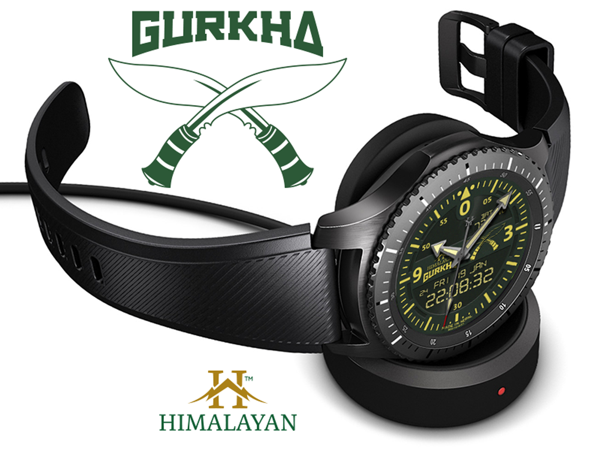
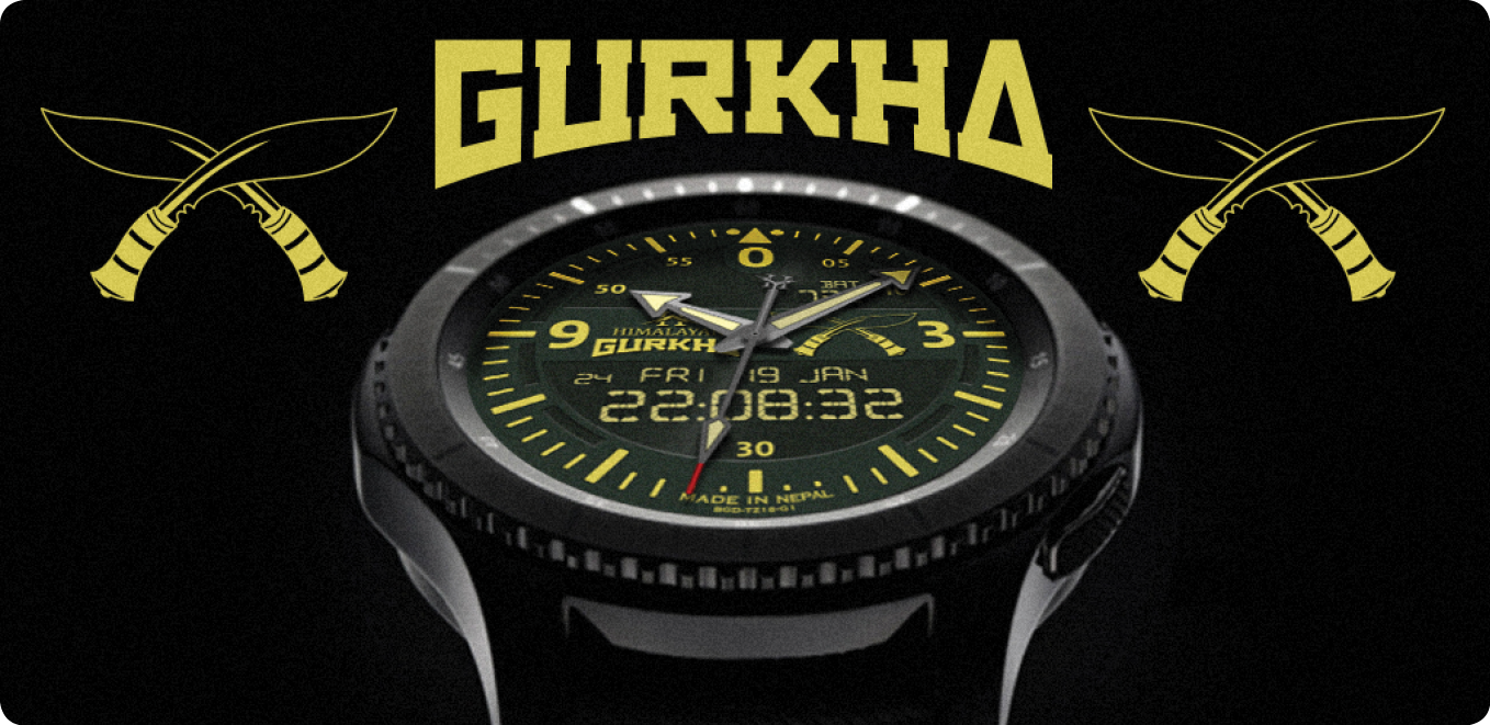
With this brand established I could then make some different faces and give them appropriate titles. The first was called the ‘Gurkha’ (fig 2). I again made a logo for this title to go with the ‘Himalayan’ title already established. Using Illustrator, I made a line art drawing of the traditional Gurkha weapon, the khukuri knife.


Gurkha-2017-Brochure-Gear-S3
Fig 2: Himalayan Gurkha Digital displayed on the Samsung Gear S3 Frontier


Each element of the watch had to be made individually, from the background, the dial numbers, dial index, and the hands. Each hand also has a shadow that needs to act accordingly. I then decided to make the watch a dual analogue and digital face. I didn’t want the standard LCD font for this though and made my own slightly more elaborate version.

As with all design jobs, this is an ongoing project where I can tweak specific design elements to my liking. This version of the ‘Gurkha’ will be going on sale in the Samsung store early in 2018.

My next project will be called the ‘Sherpa’, and this face, while looking similar, will offer step counts and altitude readings, making it the perfect companion for the trekker heading off to Everest Base Camp! Instead of having an image of khukuri knives, these will be replaced by two ice-picks used in mountain climbing.

There are many inspirations in the world of real watches, and recently on Facebook groups set up for users of these watches (Facebook, 2017), there have been many heated discussions about what constitutes copyright infringement on a watch face. For instance, could a world-renowned company such as Rolex (Rolex, 2017), claim copyright on a bezel that is green and uses a particular font? (fig 3).


Rolex Submariner
Fig 3: The Rolex Submariner with its distinctive green bezel and face.


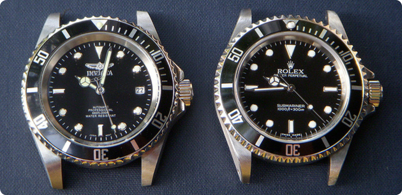
Some would argue that a) you can’t copyright a colour, and b) there are so many different watch brands that already use this style of bezel without seemingly infringing copyright (fig 4). As one blogger reflects, Rolex might have a hard time proving that a similar watch from another brand with a different name on the dial would be confused with a Rolex given the now almost generic nature of the Submariner design. (ablogtowatch.com, 2014).


Gear Watch Designer 4
Fig 4: The Invicta watch (left) and the Rolex (right) are almost identical.


What about the logo for the Omega watch company? They use the greek symbol for omega ‘Ώ’. If this were used without the word ‘Omega’ present, could it be sold as copyright infringement of a logo? CAN you copyright what is basically a letter?

As more and more smartwatch watch face designers ‘borrow’ from the real world of watches, this debate will inevitably roll on.

Gear Watch Designer 3


References:
ablogtowatch.com (2014) Why aren’t watch companies suing each other for copyright infringement all day long? [Online] Available at: https://www.ablogtowatch.com/ask-watch-experts/why-are-not-watch-companies-suing-copyright-infringement-day-long/ [Accessed: 5 December 2017]

Facebook (2017) Samsung Gear S3 Group [Online] Available at: https://www.facebook.com/groups/SamsungGearS3/?fref=nf [Accessed: 5 December 2017]

Fig 3: Rolex. Submariner [Online] Available at: https://www.rolex.com/watches/submariner.html [Accessed: 5 December 2017]

Fig 4: Rolex v Invicta. Rolex Submariner & Invicta 8926c – Comparison Photos [Online] Available at: http://forums.watchuseek.com/f71/rolex-submariner-invitca-8926c-comparison-photos-463477.html [Accessed: 5 December 2017]

Samsung (2017) Samsung Gear Watch Designer [Online] Available at: http://developer.samsung.com/gear/design/watch-designer [Accessed: 5 December 2017]

WHO SEARO Brochure

Working for WHO?

WHO SEARO Brochure

In 2015 I had the opportunity to do a job for the World Health Organisation (South East Asia Regional Office). Initially, they were using a design firm based in India to put together a series of manuals for a Sanitation Safety Planning workshop. However, the quality of the design was unacceptable for the client, and I took over the design of a tri-fold A4 brochure, and then the covers for the manuals (for consistency of design).

The original design firm had produced a graphic showing the process of managing water quality risks, but it looked amateur and cluttered (fig 1). While the process was relatively complicated, the client wanted to see a clear and attractive diagram that could be used in the brochure, on the covers for the manuals and also in PowerPoint presentations.


Original-Water-Flow-Diagram
Fig 1: Original flow diagram


My idea was to make each process appear in the style of a hexagon linear flow diagram, emulating the scientific nature of the solution. The client also wanted each element to be separate so that they could swap and change as needed for different PowerPoint slides. Due to this, the final image was not exactly as I would have liked it (fig 2), but was helpful for the client (final used image fig 3). Having seen what the first design firm came up with, the client had already made the decision to remove the text where it was highlighting the various problems that one might encounter in the various processes of water treatment.


Concept-Water-Flow-Diagram
Fig 2: Concept water management flow diagram


Final-Water-Flow-Diagram
Fig 3: Final water management flow diagram


After completing the design for the flow diagram, I started to put the copy together for the tri-fold brochure. For the bullet-points, I used hexagons to keep the general design tied together. I followed the WHO branding guidelines, which at times were conflicting and confusing, but along with the client, we managed to overcome any issues.

WHO SEARO Brochure2

The brochure included case studies, parts of which were to be linked to the bullet-points. To visualise this, I introduced different colours highlighting the relevant text. I might have used arrows linking the various texts, but I felt that this looked cluttered and messy, and wasn’t in keeping with the clean design approach we had taken.

On the inside the client wanted a chart which showed the growth of the number of water safety plans in both the rural and urban setting from 2011 to 2016. I wanted these to reflect the size so in consultation with the client we made each circle indicate the change in numbers in the circumference of the rings (fig 4).

WSP Graph

WHO SEARO Brochure3

Overall, the client was delighted with the outcome of the brochure, and the covers for the manuals helped to keep a consistent look to the whole project. On reflection, I would have liked to use the version of the flow diagram in fig 2. The limitations of the client wanting to move the icons around meant that we went with that in fig 3, but maybe with some further experimentation we could have made something that was visually better, but that had more flexibility.

UMN Logo1

Designing the UMN Logo

UMN Logo1

In 2011 I was challenged to leave my comfort zone and travel to Nepal to help an International Non-Government Organisation (INGO). The United Mission to Nepal (UMN) is a development organisation working solely in Nepal. Shortly after she joined, The Communications Director Lyn Jackson decided that a graphic designer from the west would be beneficial in helping to update their corporate image and to mentor and provide training to the self-taught Nepali graphic designer already in the team.

The first task that was immediately evident that was needed was to re-design or update the existing logo. The mark they were using had been in use for about ten years (fig 1), and straight away I could see some issues with it.

Old-UMN-logo
Fig 1: UMN Logo #3 – 2003–2011

The shape was not helpful to use on most documents as it needed to be considerably enlarged to see the necessary information. The fonts and colours were also not very modern, and the use of grey for the organisations’ name meant it did not stand out when used on anything other than a white background (and even then it was overpowered by the rest of the logo).

The history of previous logos they had used did mean that to maintain a certain level of consistency I wanted to keep some of the elements (fig 2).

Old-Old-UMN-Logos
Fig 2: UMN Logos #1 – 1970s–1993 (left) & #2 – 1993–2003 (right)

I wanted to get a sense of what people expected from a logo for UMN, so I started speaking with both Nepali and expat staff. One of the first things I came to realise was that everyone called them ‘UMN’. After consulting with the leadership team, the decision was made to drop the full title of the group and just use the acronym ‘UMN’, giving us, I felt, a better space to work with.

Also in discussion with the Leadership Team, and having taken other views on board, we decided to keep the five silhoetted figures sitting in front of a rising sun as this was in keeping with other logos of the past. They represented community interaction involving female and male participants, something that all UMN activities could relate to. It also suggested the values of capacity building, participation and local ownership, which were all key principles of UMN’s work. However, I was concerned about the quality of the five silhouettes which had initially been made in 1993 by Michael Brown. The original drawing was lost long ago and subsequent copies of it were of a poor quality and not ideal for a good, modern, clean logo.

I decided to re-draw them but still needed to make sure I kept them culturally relevant (at first I had one of the women sitting in a position which wouldn’t have been appropriate in this culture). We even spent some time debating the crease in the ‘Dhaka topi’ (Nepali hat) which the man in the centre is wearing.

The name ‘United Mission to Nepal’ was kept in full in the Nepali Sanscrit, and we placed this curved above the sun, while under the sun and silhoutted figures the initials ‘UMN’ was written. This was then all encased in a border which would allow the logo to be essentially placed anywhere without interference. The corners were rounded on the top left and bottom right of the box while being kept square on the top right and bottom left. I can not remember why I chose to do this, but may have been influenced by other Nepali work that I was seeing while travelling around Kathmandu. This box later inspired the font that would be used for the letters ‘UMN’.

For the font, I spent a few days experimenting with many different type faces, trying both serif and sans-serif. Each time I came back to the design I was unhappy with how it was looking. I started sketching some ideas and then played around with some lettering in Adobe Illustrator, and this was how the idea to round the font in the same way that the box was came about. Initially, I only needed the three letters of UMN, but later I would develop the entire alphabet for use in other situations such as for the masthead of the quarterly magazine ‘UMNews’.

UMN-Logo
Fig 3: UMN Logo #4 – 2011–Present

This logo is coming up for seven years old and is widely recognised throughout Nepal. There are no plans to change it, and we can see it being used for many more years to come. I do regret slightly not being able to use the original silhouetted figures, and if there were to be any change then this would likely be where I’d try. However, the current five are now implanted into people’s minds so much so that any change, even going back, might take some getting used to.

UMN Logo2

UMN-Logo-4