

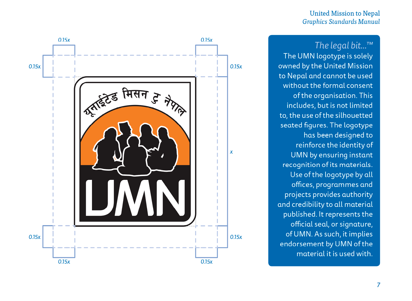
Back in 2011 when I first designed the UMN logo I put together some creative guidelines. This included advice on how to use the logo, our colours and the use of fonts. The intention was to updat this, but unfortunately, that work never got around to being completed. Earlier this year it became apparent that a much more in-depth and complete guide was needed for use not only by our staff but also by our partners.
While working on a partner profile book which listed the 46 partners who work with UMN, one of their logos surprised me. They had updated it sometime in the last couple of years, and it was using the two colours of UMN, blue and orange, and had five silhouetted figures sitting around talking. This image had been directly copied from our logo and used. The immediate concern I had was that some people would become confused when seeing this logo and might think it was directly something to do with UMN, rather than being a separate NGO. The problem was dealt with quickly, and I offered my services to design them a new logo which would be unique to them.
This then hurried along the plans to produce a new set of guidelines. I did not want these to only cover the use of our logo, however, but to cover all aspects of our creative needs.
We have called the guide ‘Graphics Standards Manual: Corporate Branding Guidelines’. However, on recent reflection and through the reading I have been doing on branding for nonprofit organisations in my annotated bibliography, I have come to realise that we should possibly drop the line ‘Corporate Branding Guidelines’. An organisation’s brand is much more than merely a logo, some fonts and a few colours. As Ritchie & Swami & Weinberg state, “Branding has evolved from humble beginnings as an extension of product packaging to its current status as a key component of organisational strategy.” (Ritchie & Swami & Weinberg, 1999). While this manual is intended to be a comprehensive guide on how to present UMN, the branding of the organisation is something much more substantial, involving mission, vision, values and strategy. As such we will consider the appropriateness of using this line.
Before beginning to compile a new set of guidelines I did some research on manuals that other organisations have produced. Content Harmony (contentharmony.com, no date) have some great ideas. They list 36 great examples of some brands that are doing it right. In almost all of them, the thing that is noticeable is that they all look simple. The KISS technique (Keep It Simple, Stupid) is essential to helping others to follow the way you intend your graphics to be used.
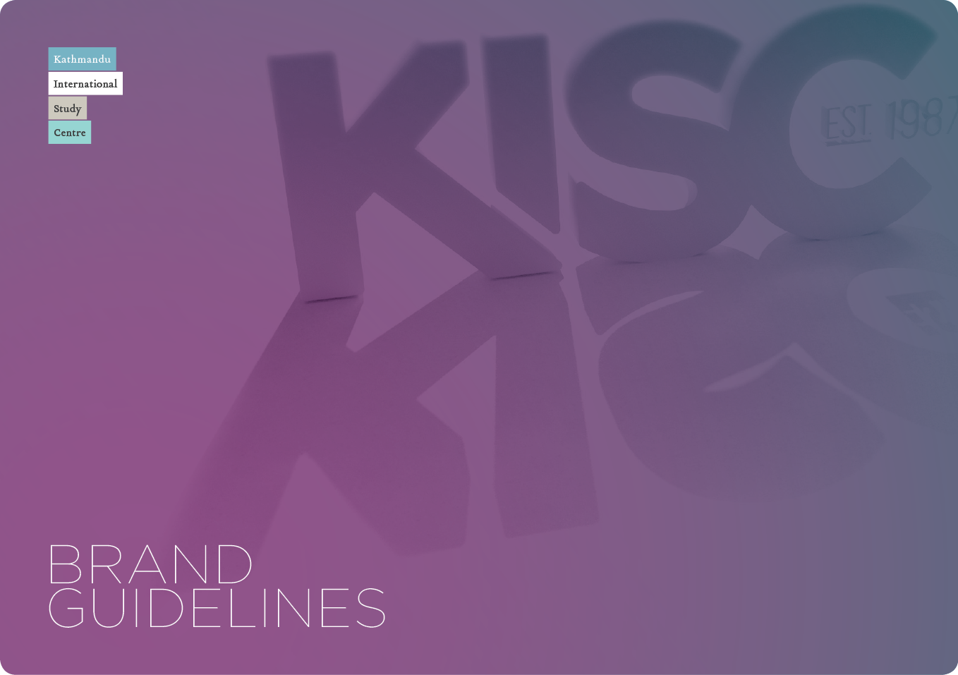
In 2010, graphic designer Matt Watson redesigned the logo and school crest for the Kathmandu International Study Centre in Nepal (KISC, 2010). He also put together a brand guidelines document which is still in use today (figs 1 & 2). His guide makes using KISC graphics very simple for anyone. A designer could be sent this and immediately be able to put together any document which would instantly be recognisable as a KISC branded item.

In creating our own Graphics Standards Manual, I have tried to emulate this. I have also included some small paragraphs explaining what a logotype is, what it is used for and why it is essential to use it correctly, and the same for the use of fonts and colours.

At the beginning of the year, we discovered that many staff within UMN had set up an electronic signature on their emails. Unfortunately, many people did not follow the guide we had set out to do this. Some were using multiple fonts, colours and size of text within the same signature. We decided that we needed to have a uniformity about our emails, and with the help of the Information Technology Services Team and one of my colleagues in the Communications Team, we designed a beautiful looking signature which could be generated by visiting a link to our website (UMN, 2017). The user just needed to fill out their relevant details such as name, job title and email address, then select the team they worked in from a drop-down menu. Other options such as mobile number and desk extension were optional, and once all was filled out, they merely had to click on the generate button and copy and paste the signature that appeared into the email client of their choice. This has helped to bring cohesion to the message that is coming out of UMN.
We hope that this manual will not only help to make sure everything coming out of UMN looks the same, but will also help to strengthen the brand image of the organisation. The manual will be an ongoing project and will include templates for Microsoft Word documents, PowerPoint presentations and an Image Policy.
As the maxim goes, “It is not what you say, it’s how you say it.”
References:
contentharmony.com, (no date) 36 great brand guidelines examples. [Online] Available at: https://www.contentharmony.com/blog/great-brand-guidelines/ [Accessed: 10 December 2017]
KISC, (2010) Kathmandu International Study Centre. [Online] Available at: https://www.kisc.edu.np/ [Accessed: 10 December 2017]
Ritchie, R. J. B., Swami, S. & Weinberg, C. B. (1999) ‘A brand new world for nonprofits’, International Journal of Nonprofit and Voluntary Sector Marketing, 4(1), p. 26.
UMN, (2017) United Mission to Nepal email signature. [Online] Available at: http://www.umn.org.np/signature [Accessed: 10 December 2017]