Today’s the day! After finishing my new book, “The Lokta Illustrated Bible: Creation”, I decided that to help with the publicity I would re-design my website. Weeks of work has resulted in what you see here. I hope it is helpful to learn a little more about my books.
I have already started the second volume, “The First Family”, and with the website now finished I can dedicate more of my time to that. My hope is that I can publish three ‘Lokta Illustrated Bible’ stories a year. I’m still on course for that this year!
I’d love to hear from you if you have any questions or feedback to give. The book will be launched on 9 March 2021, and stay tuned for a Zoom launch party, with prizes for sharing.
We live in a world where images are critical. Since the invention of print media, the need for it to look slick and eye-catching has presented a demand for skilled graphic designers.
In their 6th edition update of Meggs’ History of Graphic Design, Philip Meggs and Alston Pruvis note that during the last quarter of the Twentieth Century and the first decades of the Twenty-first Century, electronic and computer technology has advanced at an extraordinary pace, and this has transformed many areas of human activity (Meggs & Pruvis, 2016). With the development of the internet, the world moved into web publishing, and graphic designers went with them. The graphic design industry is bound to technology, and as technology continues to advance, the graphic design field adapts with it.
In their blog post proposing why graphic design is ideal for digital marketing today, the InfoGraphic Design Team recognises that consumers have a short attention span in today’s fast-paced world. They suggest that a clear stellar visual accompanied with brief content is the only way of gaining attention (infographicdesignteam.com, 2018).
The goal of this research paper is to look at how the advancement of computer technology, and with it, the rise of social media, has affected the field of graphic design.
With the influence of social media sites such as Facebook, Twitter, Pinterest and Instagram, the online market has become much more interactive, robust and lively. Multiple social media platforms have been drastically altering the digital marketing world.
Adam Lehrman, the founder of Tucson Foodie and Soapbox Social Media, notes that a branding project that used to include a business card, envelope and letterhead, now needs to incorporate a profile image and cover image as well (Quora, 2014). He goes on to acknowledge that this is not always as simple as placing a logo into the middle of a square. Ideally, brands now need a square version of their logo.
As smartphones and tablets have become commonplace, any online content now needs to be tailored with these in mind. Websites need to be developed as responsive sites, with mobiles or tablets likely to be the first places the content will be viewed. It might also be necessary to create different images for use on different platforms due to the various sets of graphical resolution requirements.
With sites such as Behance, Dribbble, and to some extent, Pinterest, it is now effortless to post work and get instant feedback which can help designers refine their work fast, although sometimes there can be a lot of different opinions and one needs to learn how to filter these to ultimately improve the job and deliver the brief accurately.
In the 5th edition of Meggs’ History of Graphic Design, Philip Meggs and Alston Pruvis recognise that the introduction of the iPod placed new demands on the design of the album cover, which had suddenly shrunk to less than one square inch. Since the 1960s, the album cover had been a canvas for designers and featured iconic, generational images (Meggs & Pruvis, 2011). With the introduction of the compact disc (CD) in the 1980s, album covers had already begun to shrink, forcing more minimal designs to be used on the smaller format (ibid).
With vinyl album covers in the 12″ format, they were often limited to either having just a front and back design, or in some cases, a gatefold design could be employed – usually when it was a double album – which would give four sides for the designer to use. With the advent of the CD, while the design needed to be much smaller, multi-page booklets containing liner notes was now a possibility, and it was unusual not to find designers taking advantage of this. With mp3s and streaming sites such as iTunes and Spotify replacing the CD, the joy of reading the accompanying booklet and enjoying more images than the cover allows are gone. While social media accounts and artists web pages might be a source for this information, the details are often harder to find (Gaillot, 2017). In her article on the failed experiment of the digital album booklet for the website The Outline, Ann-Derrick Gaillot notes that while creative album artwork and promo persists, the materials that accompany the visuals and the music have yet to catch up to the ways we consume music (ibid). Gaillot also remarks that in an age where branding is often as important as skill, the lack of digital booklets feels like a wasted opportunity (ibid).
A similar problem has befallen the design for books, with many users choosing to read in digital format, be it an Amazon Kindle or similar e-reader, book covers are now rarely seen, and often only in a small format while buying the book online. Has this had an impact on how graphics are used for covers?
Catalogue of films from a personal Plex Media account
With the rapid rise of streaming services for films and TV shows on sites such as Netflix or Amazon Prime, the design for a traditional movie poster or key art has had to change. In the Eye on Design article about the art of the movie poster in the age of Netflix, Andrew Percival of Los Angeles based studio Percival + Associates states that streaming services like Netflix have revolutionised the industry as it has pushed companies to research new approaches in how to operate. Today, working in entertainment design means producing imagery that will remain equally intriguing at the scale of a billboard or the size of a thumbnail on our laptops and smart devices (Andersen, 2018). The designer also needs to consider what imagery is likely to compel the user to press play.
How has all of this affected the role of the graphic designer, and what changes are likely to challenge us in the future?
Meggs, P. B. and Purvis, A. W. (2011) ‘Meggs’ History of Graphic Design’, p. 624. doi: 10.1021/cr050149z.
Meggs, P. B. and Pruvis, A. W. (2016) ‘The Digital Revolution — and Beyond’, in Meggs’ History of Graphic Design. 6th edn. John Wiley & Sons, Incorporated, pp. 570–619.
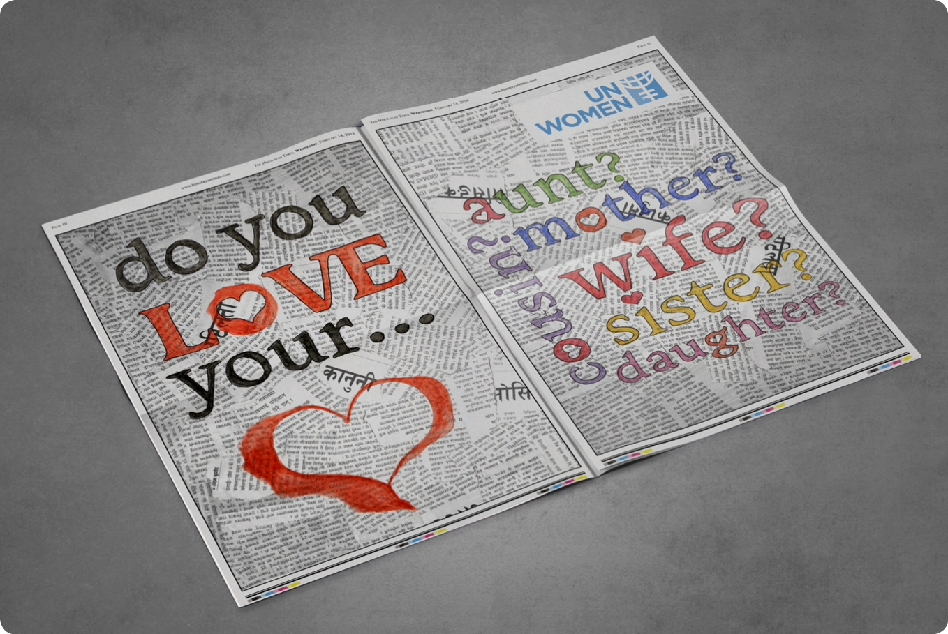
For my Audiences project of the FAT2 Practice module, I have chosen to imagine I’m working for UN Women in Nepal. The idea is that we are going to run a campaign to try and end Chhaupadi.
Chhaupadi is the act of seclusion that women in rural Nepal have to go through during their menstrual cycles. During this time they are deemed unclean and untouchable. They will not be allowed to touch anyone, cook the food or enter a temple. As part of the process, they aren’t allowed to sleep in the house with the rest of their family and instead are forced to stay in either a small hut that has been erected for such occasions or to sleep in a shed with cows or goats. There are some dangers associated with this from snake attacks, rape or even death from being out in the elements. There have been some deaths to young girls reported recently, with one woman dying from carbon monoxide poisoning after a build-up of the dangerous gas occurred when the small heater she had in the shed with here malfunctioned.
For this assignment, I’ve made two double-page spread adverts to run in the Himalayan Times on valentines day over concurrent pages. The first spread would have two pages of valentines messages, and painted over the top of these would be the question “do you love your…” with some female family member groups mentioned. The hearts are supposed to look like they are painted with blood.
The second spread would be just over the page and has a full-page picture of a typical hut that these women would be expected to stay in, with the phrase “a woman’s place is in the home” printed. I have chosen to reclaim this old sexist saying and use it for good. In the west a few decades ago, the phrase was meant to discourage women from going to work, but instead to stay at home and cook and clean. In this context, I’m choosing to use it to show that a woman should be sleeping in the safe family home, rather than in a cold and dangerous hut in a field.
I wanted to show the beauty of Nepal with the harsh reality of the women’s plight. In so doing I have merged a few images to show a field, the hut and the Himalayan mountain range in the background.
NOTE: UN Women have in no way endorsed these images.
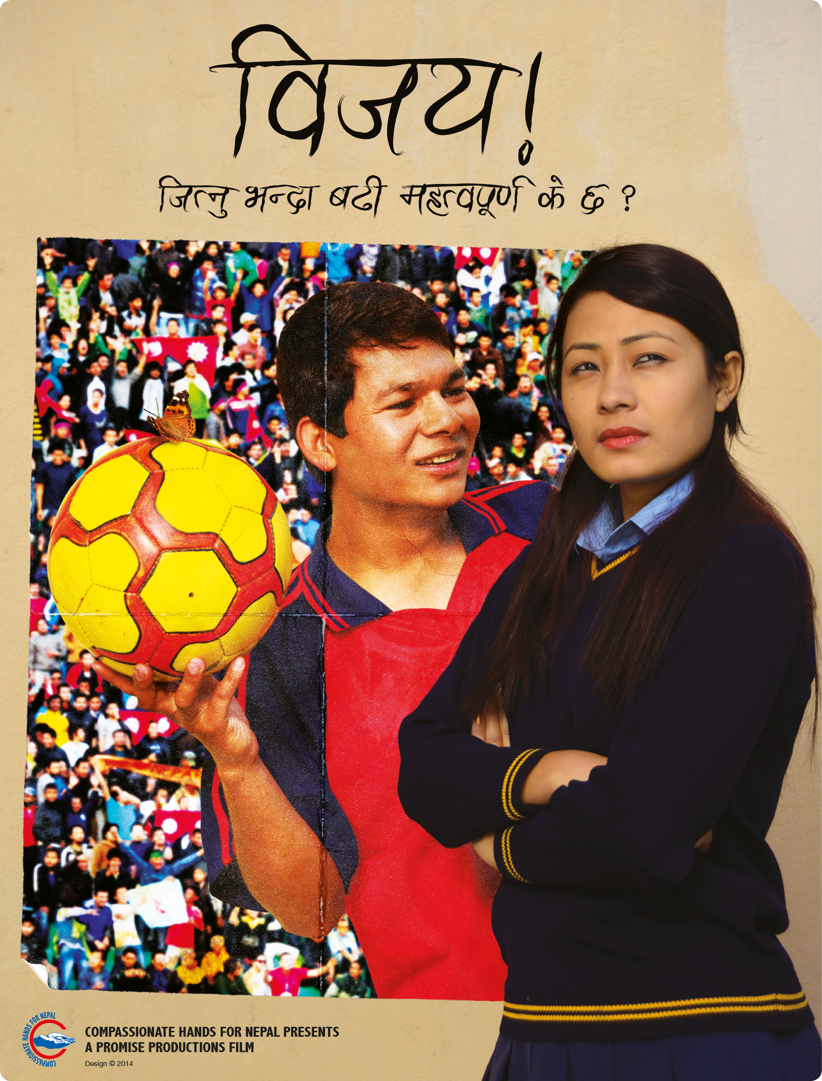
Before I came to Nepal, I worked for a company designing DVD sleeves and point of purchase items for the film industry. So maybe it was only fitting that a few years ago I was approached to create a poster for the Nepali film Bijay! (Bijay, 2014).
To start my research into this film, one of the producers gave me a screening of the movie. The film centres around a teenage boy named Bijay (which means ‘victory’). Bijay is crazy about football and wants to play for Nepal one day. His girlfriend is frustrated that all his attention is on football, and even some of his teammates get annoyed with him when he keeps the ball to himself in games and won’t pass, preferring to take all the glory for himself. This gets worse when some scouts come to see his team play.
There were a few themes from the film that stood out. Firstly, Bijay had a lot of posters of star football players on the wall of his room. He spent a lot of time staring at the posters and dreaming of being a star himself. The second thing that struck me was a scene where he was watching a caterpillar crawl along a wall. Later in the film, he found a cocoon hanging from a branch near the same spot, and then later still Bijay watches the butterfly emerge. These scenes all came at poignant moments and were signifying that to succeed in life (and in love) he needed to change.
There had already been a photoshoot with the actors playing Bijay and his girlfriend, and the producer had an idea of having them both inside the national football stadium. After watching the movie again on my own, I had a plan to use the concept of a poster within the poster. I pitched this to the producer, and he liked how it sounded.
My thought was to use an image that they had taken of Bijay and his girlfriend leaning against a wall. In the picture, Bijay was looking at his girlfriend while she had an annoyed look on her face into the distance. Bijay was in a football kit and holding a football. I chose to frame Bijay into a poster, with the football stadium as a background for it. His girlfriend remained standing against the wall as if separated from him, but also together. As a final touch, I added a butterfly resting on the football. The poster was then given a different lighting effect to the rest of the image and aged to make it look more realistic (fig 1).
Fig 1: Final poster for the film Bijay!
The producers were extremely pleased with the outcome. On reflection, I would have liked to have had more control over the photoshoot. The wall that they were leaning against was reasonably dull, and maybe it could have been given more character.
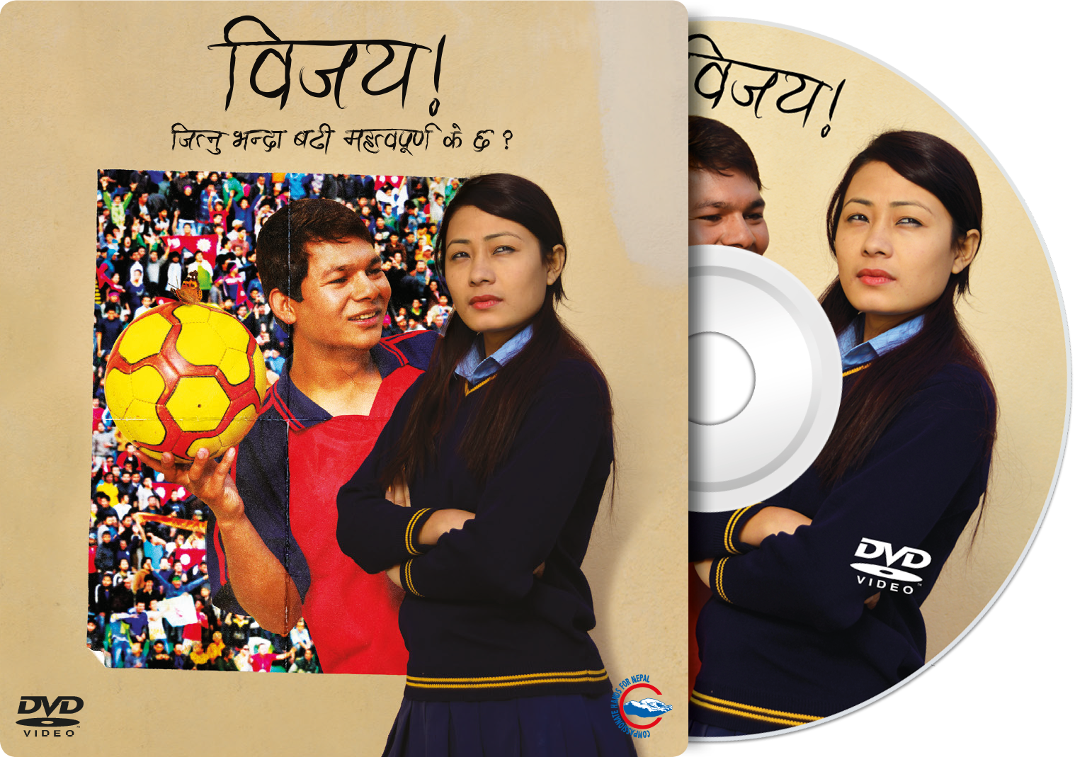
The image was then also used on the DVD sleeve, and I used the unaltered image of Bijay and his girlfriend for the DVD label.
Fig 2: DVD cardboard sleeve and disc for the film Bijay!
References: Bijay! (2014) Film. Directed by Unknown. [DVD]. Nepal: Promise Productions.
Back in 2011 when I first designed the UMN logo I put together some creative guidelines. This included advice on how to use the logo, our colours and the use of fonts. The intention was to updat this, but unfortunately, that work never got around to being completed. Earlier this year it became apparent that a much more in-depth and complete guide was needed for use not only by our staff but also by our partners.
While working on a partner profile book which listed the 46 partners who work with UMN, one of their logos surprised me. They had updated it sometime in the last couple of years, and it was using the two colours of UMN, blue and orange, and had five silhouetted figures sitting around talking. This image had been directly copied from our logo and used. The immediate concern I had was that some people would become confused when seeing this logo and might think it was directly something to do with UMN, rather than being a separate NGO. The problem was dealt with quickly, and I offered my services to design them a new logo which would be unique to them.
This then hurried along the plans to produce a new set of guidelines. I did not want these to only cover the use of our logo, however, but to cover all aspects of our creative needs.
We have called the guide ‘Graphics Standards Manual: Corporate Branding Guidelines’. However, on recent reflection and through the reading I have been doing on branding for nonprofit organisations in my annotated bibliography, I have come to realise that we should possibly drop the line ‘Corporate Branding Guidelines’. An organisation’s brand is much more than merely a logo, some fonts and a few colours. As Ritchie & Swami & Weinberg state, “Branding has evolved from humble beginnings as an extension of product packaging to its current status as a key component of organisational strategy.” (Ritchie & Swami & Weinberg, 1999). While this manual is intended to be a comprehensive guide on how to present UMN, the branding of the organisation is something much more substantial, involving mission, vision, values and strategy. As such we will consider the appropriateness of using this line.
Before beginning to compile a new set of guidelines I did some research on manuals that other organisations have produced. Content Harmony (contentharmony.com, no date) have some great ideas. They list 36 great examples of some brands that are doing it right. In almost all of them, the thing that is noticeable is that they all look simple. The KISS technique (Keep It Simple, Stupid) is essential to helping others to follow the way you intend your graphics to be used.
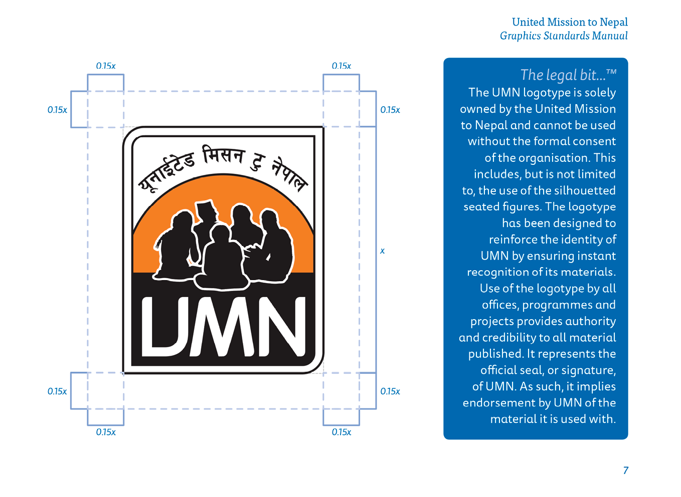
In 2010, graphic designer Matt Watson redesigned the logo and school crest for the Kathmandu International Study Centre in Nepal (KISC, 2010). He also put together a brand guidelines document which is still in use today (figs 1 & 2). His guide makes using KISC graphics very simple for anyone. A designer could be sent this and immediately be able to put together any document which would instantly be recognisable as a KISC branded item.
Fig 1: KISC Brand Guidelines
Fig 2: KISC Brand Guidelines
In creating our own Graphics Standards Manual, I have tried to emulate this. I have also included some small paragraphs explaining what a logotype is, what it is used for and why it is essential to use it correctly, and the same for the use of fonts and colours.
Fig 3: Use of the UMN logotype from ‘Graphics Standards Manual’
Fig 4: Use of the UMN vision & vine line from ‘Graphics Standards Manual’
At the beginning of the year, we discovered that many staff within UMN had set up an electronic signature on their emails. Unfortunately, many people did not follow the guide we had set out to do this. Some were using multiple fonts, colours and size of text within the same signature. We decided that we needed to have a uniformity about our emails, and with the help of the Information Technology Services Team and one of my colleagues in the Communications Team, we designed a beautiful looking signature which could be generated by visiting a link to our website (UMN, 2017). The user just needed to fill out their relevant details such as name, job title and email address, then select the team they worked in from a drop-down menu. Other options such as mobile number and desk extension were optional, and once all was filled out, they merely had to click on the generate button and copy and paste the signature that appeared into the email client of their choice. This has helped to bring cohesion to the message that is coming out of UMN.
We hope that this manual will not only help to make sure everything coming out of UMN looks the same, but will also help to strengthen the brand image of the organisation. The manual will be an ongoing project and will include templates for Microsoft Word documents, PowerPoint presentations and an Image Policy.
As the maxim goes, “It is not what you say, it’s how you say it.”
KISC, (2010) Kathmandu International Study Centre. [Online] Available at: https://www.kisc.edu.np/ [Accessed: 10 December 2017]
Ritchie, R. J. B., Swami, S. & Weinberg, C. B. (1999) ‘A brand new world for nonprofits’, International Journal of Nonprofit and Voluntary Sector Marketing, 4(1), p. 26.
UMN, (2017) United Mission to Nepal email signature. [Online] Available at: http://www.umn.org.np/signature [Accessed: 10 December 2017]
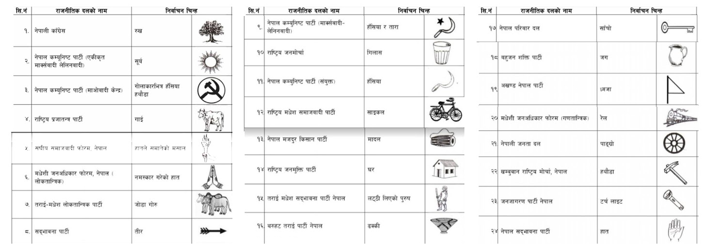
Yesterday in the Kathmandu valley it was election day. Earlier this year I designed some new business cards for the Nepali political party ‘Janajagaran’ (which means public awareness).
In Nepal, each prospective party is designated an election symbol as a way to help people identify the candidate that they want to vote for (not all voters will be able to read well enough to find the party they intend to vote for, and there are usually over 20 parties listed). The symbol for Nepali Congress is a tree, while CPN-UML has a sun, and CPN-Maoist Centre uses a hammer and sickle. There are many more (fig 1), from a cow to a bike and even a house. The symbol that Janajagaran were given is a torch (fig 2).
Fig 1: A list of Nepali political parties and their election symbols for the 2017 election.
Fig 2: Janajagaran Party election mark.
The ‘logo’ for the Janajagaran party is a flag which consists of a red triangle on top of a split of blue (top) and green (bottom). Inside the triangle are seven six-pointed stars representing the seven issues that the party stand for.
Recently having looked at a blog on ‘Top 6 Business Card Trends In 2017’ (Designhill, 2017), I am satisfied that the card I created for the party reflects current patterns in business cards. Some of the listed trends are the simplicity of design, using your brand elements, big typeface, witty puns and symbols, and interactive card design. The article further mentions that the central purpose of business cards is to deliver contact details of the company while also making a lasting impression on the client. These were both crucial for the business card of Janajagaran Political Party.
The card undertook the simplicity aspect as it is easily readable and understood by both Nepali and non-Nepali readers. The business card further made sure it had the branding elements of the political party such as the colour, logo and the seven stars.
As the party aims to become a shining light for the country of Nepal, I used the torch, the party’s election mark, as more of a prominent feature and symbol on the card. Generally, the symbol is just included somewhere to inform voters of the party’s mark. In contrary to the general Nepali trend, I had the light coming out of the torch revealing the relevant information including the contact information. At first, I used the two primary colours of the flag and then had drawn a nice clean, modern looking torch to come in from the bottom right, splitting the two colours. However, I later found out that I could not change the style of the torch as this had to be the same as the image assigned to them by the Election Commision. I did re-draw the torch in Illustrator, keeping the style the same to avoid confusion, as the only version available was a poor thumbnail image.
On reflection, I realise that it is crucial for a designer to understand the context of the client and the country, especially if the work involves governmental, political or legal clients. I have learnt that I should always explore such issues with clients beforehand.
The card is in English on one side and Nepali on the other. I was pleased with the final outcome and delighted with how the torch and light effect looks (fig 3).
Fig 3: Final Janajagaran Party business card (English version).
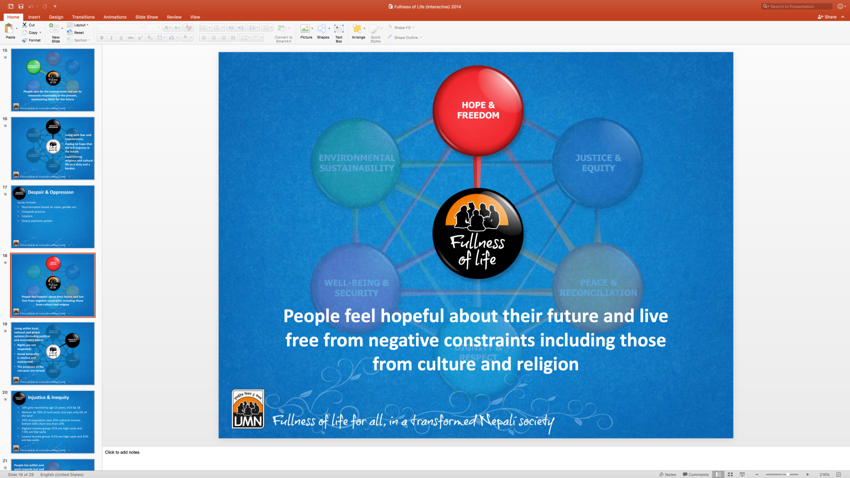
In development work, UMN knows that poverty arises from a complex web of inter-related causes (fig 1). They turned this understanding of poverty on its head and tried to describe its opposite. The result was the fullness of life model. What UMN wanted to show in a simple graphic was how the impacts of actions taken in one area of a person or community’s life flow through into other areas (UMN, 2011).
Fig 1: Life of poverty diagram (UMN, 2011)
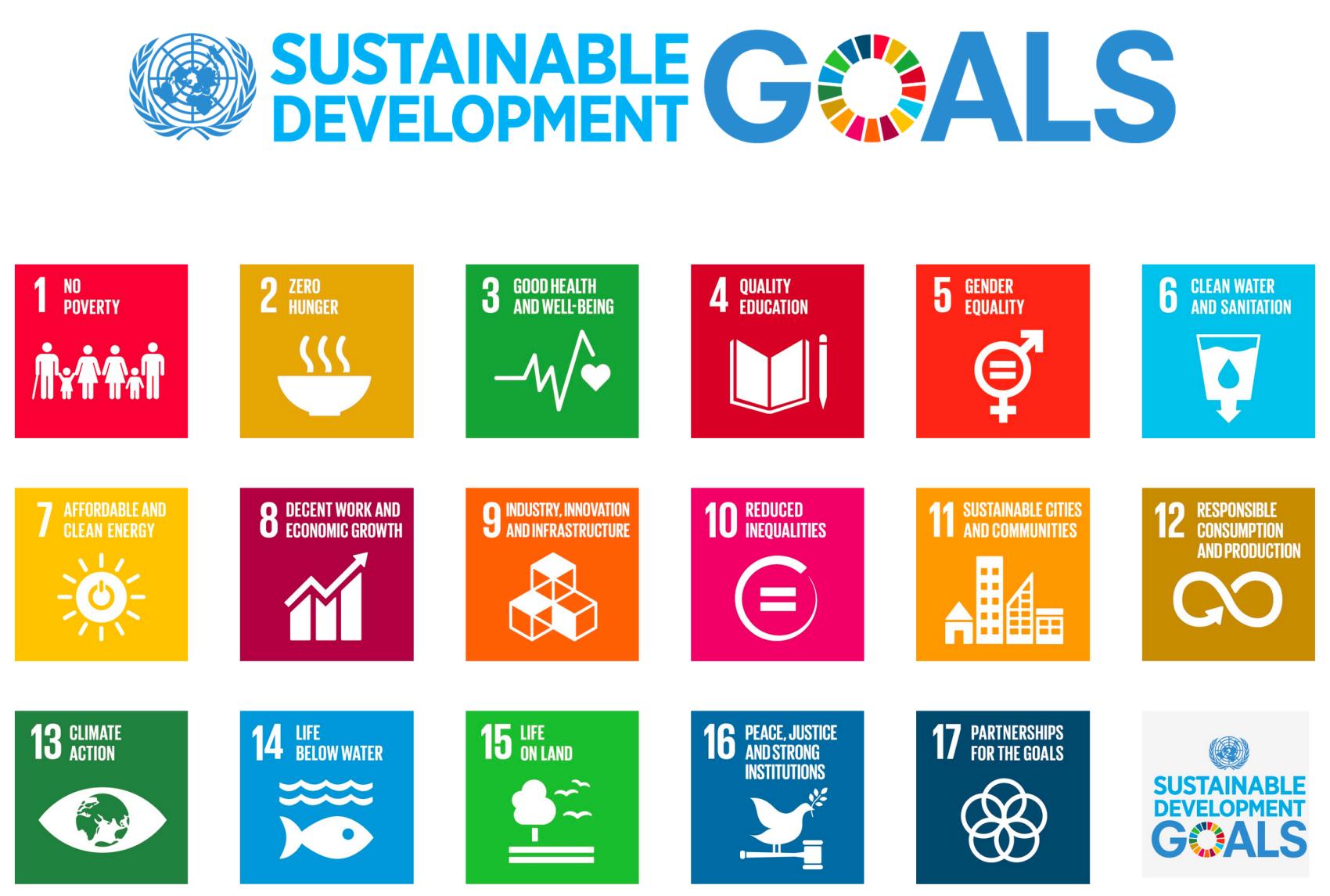
In 2011 I was given the task of producing this graphic. I did some research and found that what we were trying to achieve was in a way similar to the Millenium Development Goals (now called the Sustainable Development Goals) (fig 2) that the United Nations had agreed to.
Fig 2: UN Sustainable Development Goals (UN, 2015)
I liked the idea of having different colours for each goal/area of work, so we chose to use six different colours for each. We didn’t want these to be stand-alone graphics, however, but to all be connected reflecting the complex web of inter-related causes. I merged the colours into each other to show further linkage (fig 3).
In the middle of the whole web there used to be a black button with the logo of UMN and the type “Fullness of life for all”, however on reflection I wanted to show more of how each of the six areas can bring about the fullness of life. In 2016 I updated the graphic slightly, using one of the fonts we had adopted as an organisation, and in the centre, I made a background of bubbles made up of all the different colours and mingling with each other. I removed the UMN logo part of it as whenever it is used the logo accompanies it (either on a poster, in PowerPoint or a document), and I felt that this was no longer necessary.
Fig 3: Fullness of life diagram (UMN, 2011)
This model has proved popular within the organisation for explaining UMN’s fullness of life theory and showing how by changing one thing in someone’s life, other areas can also be positively affected. I have heard since that other NGOs have even referred to it.
After the diagram was finished and we’d had posters printed, I made a PowerPoint presentation for use by anyone that needed to present some or all of UMN’s fullness of life ideas. I saw that the Executive Director had been using one which I felt could be improved upon with some smart features of PowerPoint. To help with this, I made different images highlighting each of the different areas, but had the rest of the diagram fade slightly. It could still be seen, but now it would help focus the audience receiving the presentation onto which area was being discussed (fig 4). There was also a slide which faded from the ‘life of poverty’ model into the ‘fullness of life’ model.
Fig 4: Fullness of Life interactive PowerPoint presentation
This presentation needs to be updated to reflect the latest design (figs 1 & 3), but overall these improvements have made it easier for people to see the interaction between the different areas of the model.
On further reflection, each of the areas might benefit from some a graphic or icon to reflect the chosen subject. This would be more like the Sustainable Development Goals and could help to illustrate the work.
References: UMN (2011) Fullness of Life model. [Online] Available at: http://www.umn.org.np/our-vision [Accessed: 14 November 2017].
My mum runs a small business from her home where she makes and sells homemade greetings cards. She wanted to have an online presence, and as a gift, I designed her a logo that could be printed on cards and sent with orders, or given out at craft fairs. Her name is Sheila, so the name of the company is simply ‘Sheila’s Cards’.
I didn’t spend long doodling some sketches before I came up with the idea of making the letter ‘S’ into the shape of a card standing up (fig 1). Once I’d got the general idea, it all fell into place quite quickly. I chose to use the colour pink and floral pattern for the cover of the card as most of the people who would be buying her cards would be female. I felt that this would have an appeal to them. For the background, I used a pastel shade of blue as I felt this complemented the pink cover. I had some of the flowers floating off the ‘S’ to represent the handcrafted nature of the cards she produces.
Fig 1: Sheila’s Cards logo
There was not much of a consultation on the logo. It was one of those moments when everything came together very quickly, and everyone was happy with how it looked. However, I have come to realise that perhaps some consultation with the client would have been helpful to the process to understand their expectations. In this case, though, the work without much discussion was acceptable as I had a personal relationship with the client and I knew what she wanted.
Once the logo was agreed on, I put together some contact details to make a business card which could be passed along with orders. For this, I made some small icons to go with the various forms of communication and chose a handwritten style font. The result can be seen below (fig 2).
Fig 2: Sheila’s Cards visiting/business cards, front and back
With the advent of smartwatches, there is now the opportunity for owners of the Samsung Gear range of watches to design their own faces, either for personal use or to sell on the Samsung store.
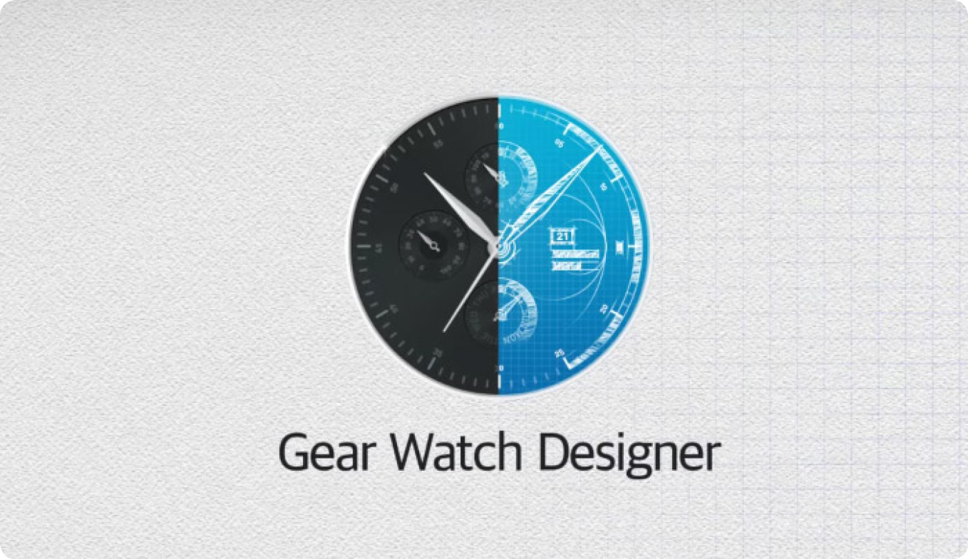
Watches are put together using the software ‘Gear Watch Designer’ (Samsung, 2017) available for both Windows and Mac OS. This software is in beta testing so has a lot of bugs, but provides one of the best ways for designers with little or no programming skills to make a functioning watch face.
Designs can be made using the stock image provided with the GWD software, or by making your own graphics using popular design software such as Photoshop or Illustrator.
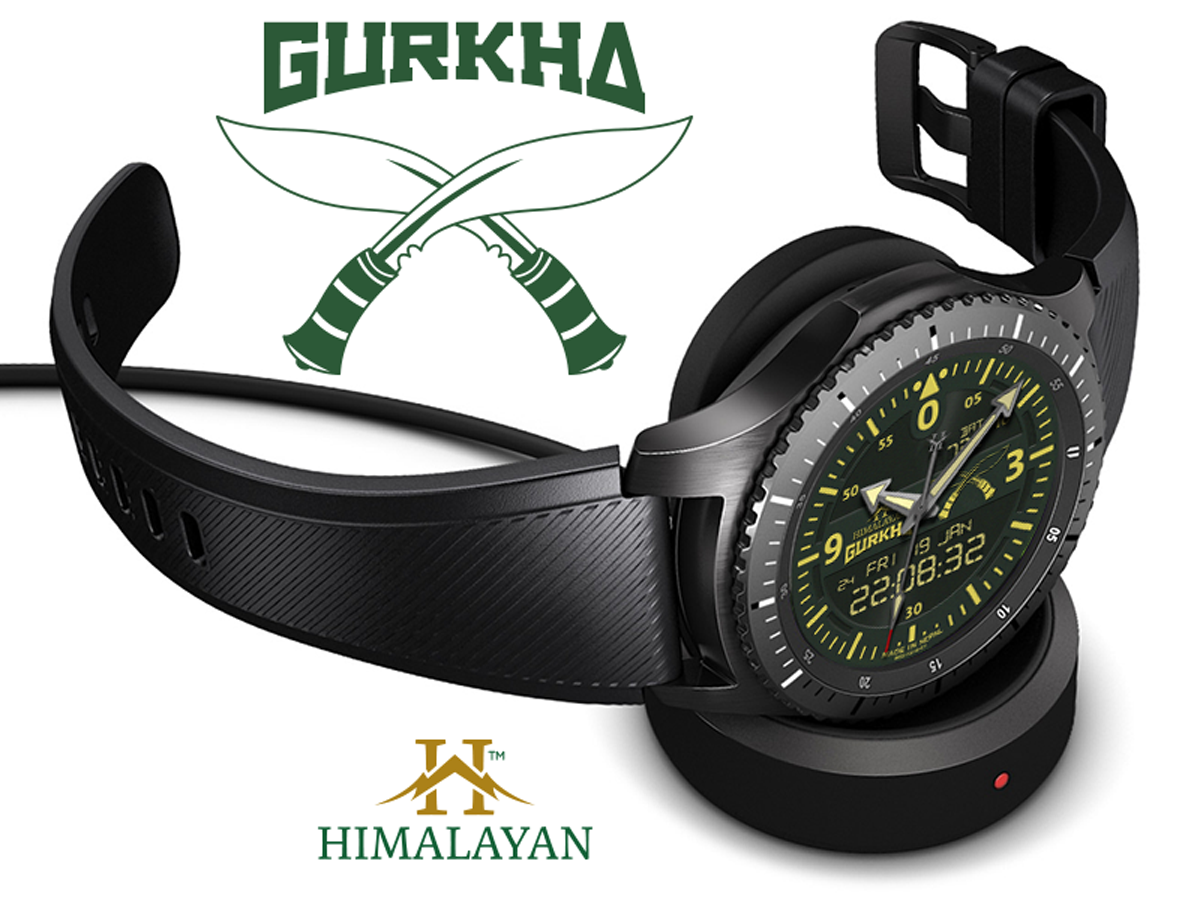
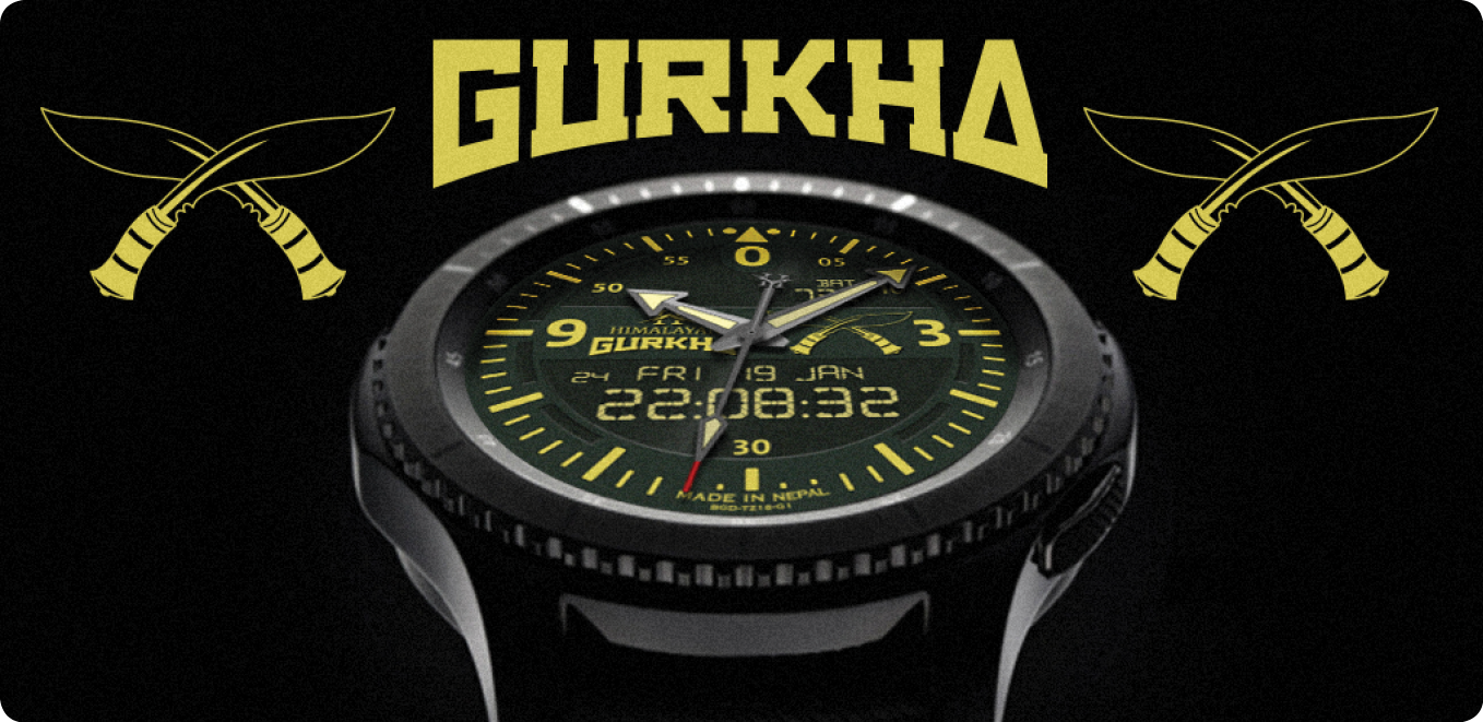
I have been designing watch faces for about a year now, and as the software develops, so the designs can become more involved. To keep my watches on a theme I first ‘established’ a brand name and designed a logo that I could use on all the different faces I made. The name I decided on was ‘Himalayan’ (fig 1). The main icon is the letter ‘H’ with the cross-section made to look like mountains.
Fig 1: Himalayan Watches logo
With this brand established I could then make some different faces and give them appropriate titles. The first was called the ‘Gurkha’ (fig 2). I again made a logo for this title to go with the ‘Himalayan’ title already established. Using Illustrator, I made a line art drawing of the traditional Gurkha weapon, the khukuri knife.
Fig 2: Himalayan Gurkha Digital displayed on the Samsung Gear S3 Frontier
Each element of the watch had to be made individually, from the background, the dial numbers, dial index, and the hands. Each hand also has a shadow that needs to act accordingly. I then decided to make the watch a dual analogue and digital face. I didn’t want the standard LCD font for this though and made my own slightly more elaborate version.
As with all design jobs, this is an ongoing project where I can tweak specific design elements to my liking. This version of the ‘Gurkha’ will be going on sale in the Samsung store early in 2018.
My next project will be called the ‘Sherpa’, and this face, while looking similar, will offer step counts and altitude readings, making it the perfect companion for the trekker heading off to Everest Base Camp! Instead of having an image of khukuri knives, these will be replaced by two ice-picks used in mountain climbing.
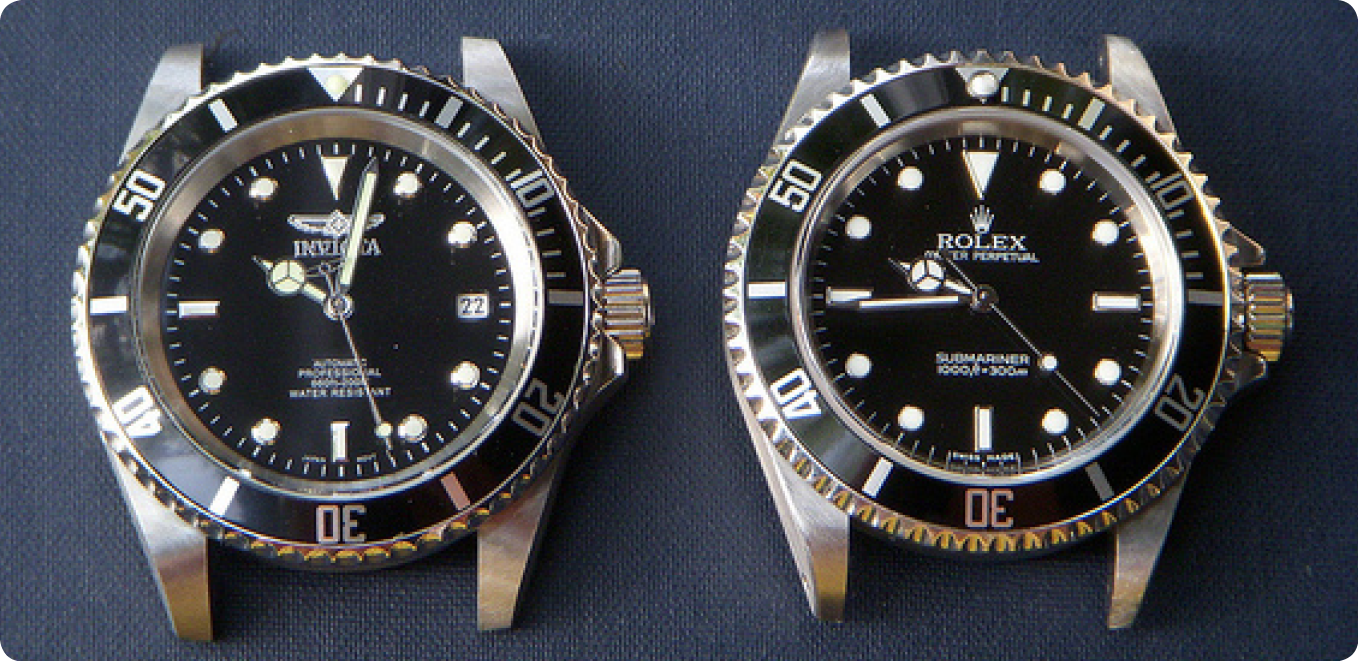
There are many inspirations in the world of real watches, and recently on Facebook groups set up for users of these watches (Facebook, 2017), there have been many heated discussions about what constitutes copyright infringement on a watch face. For instance, could a world-renowned company such as Rolex (Rolex, 2017), claim copyright on a bezel that is green and uses a particular font? (fig 3).
Fig 3: The Rolex Submariner with its distinctive green bezel and face.
Some would argue that a) you can’t copyright a colour, and b) there are so many different watch brands that already use this style of bezel without seemingly infringing copyright (fig 4). As one blogger reflects, Rolex might have a hard time proving that a similar watch from another brand with a different name on the dial would be confused with a Rolex given the now almost generic nature of the Submariner design. (ablogtowatch.com, 2014).
Fig 4: The Invicta watch (left) and the Rolex (right) are almost identical.
What about the logo for the Omega watch company? They use the greek symbol for omega ‘Ώ’. If this were used without the word ‘Omega’ present, could it be sold as copyright infringement of a logo? CAN you copyright what is basically a letter?
As more and more smartwatch watch face designers ‘borrow’ from the real world of watches, this debate will inevitably roll on.