WHO SEARO Brochure

Working for WHO?

WHO SEARO Brochure

In 2015 I had the opportunity to do a job for the World Health Organisation (South East Asia Regional Office). Initially, they were using a design firm based in India to put together a series of manuals for a Sanitation Safety Planning workshop. However, the quality of the design was unacceptable for the client, and I took over the design of a tri-fold A4 brochure, and then the covers for the manuals (for consistency of design).

The original design firm had produced a graphic showing the process of managing water quality risks, but it looked amateur and cluttered (fig 1). While the process was relatively complicated, the client wanted to see a clear and attractive diagram that could be used in the brochure, on the covers for the manuals and also in PowerPoint presentations.


Original-Water-Flow-Diagram
Fig 1: Original flow diagram


My idea was to make each process appear in the style of a hexagon linear flow diagram, emulating the scientific nature of the solution. The client also wanted each element to be separate so that they could swap and change as needed for different PowerPoint slides. Due to this, the final image was not exactly as I would have liked it (fig 2), but was helpful for the client (final used image fig 3). Having seen what the first design firm came up with, the client had already made the decision to remove the text where it was highlighting the various problems that one might encounter in the various processes of water treatment.


Concept-Water-Flow-Diagram
Fig 2: Concept water management flow diagram


Final-Water-Flow-Diagram
Fig 3: Final water management flow diagram


After completing the design for the flow diagram, I started to put the copy together for the tri-fold brochure. For the bullet-points, I used hexagons to keep the general design tied together. I followed the WHO branding guidelines, which at times were conflicting and confusing, but along with the client, we managed to overcome any issues.

WHO SEARO Brochure2

The brochure included case studies, parts of which were to be linked to the bullet-points. To visualise this, I introduced different colours highlighting the relevant text. I might have used arrows linking the various texts, but I felt that this looked cluttered and messy, and wasn’t in keeping with the clean design approach we had taken.

On the inside the client wanted a chart which showed the growth of the number of water safety plans in both the rural and urban setting from 2011 to 2016. I wanted these to reflect the size so in consultation with the client we made each circle indicate the change in numbers in the circumference of the rings (fig 4).

WSP Graph

WHO SEARO Brochure3

Overall, the client was delighted with the outcome of the brochure, and the covers for the manuals helped to keep a consistent look to the whole project. On reflection, I would have liked to use the version of the flow diagram in fig 2. The limitations of the client wanting to move the icons around meant that we went with that in fig 3, but maybe with some further experimentation we could have made something that was visually better, but that had more flexibility.

UMN Logo1

Designing the UMN Logo

UMN Logo1

In 2011 I was challenged to leave my comfort zone and travel to Nepal to help an International Non-Government Organisation (INGO). The United Mission to Nepal (UMN) is a development organisation working solely in Nepal. Shortly after she joined, The Communications Director Lyn Jackson decided that a graphic designer from the west would be beneficial in helping to update their corporate image and to mentor and provide training to the self-taught Nepali graphic designer already in the team.

The first task that was immediately evident that was needed was to re-design or update the existing logo. The mark they were using had been in use for about ten years (fig 1), and straight away I could see some issues with it.

Old-UMN-logo
Fig 1: UMN Logo #3 – 2003–2011

The shape was not helpful to use on most documents as it needed to be considerably enlarged to see the necessary information. The fonts and colours were also not very modern, and the use of grey for the organisations’ name meant it did not stand out when used on anything other than a white background (and even then it was overpowered by the rest of the logo).

The history of previous logos they had used did mean that to maintain a certain level of consistency I wanted to keep some of the elements (fig 2).

Old-Old-UMN-Logos
Fig 2: UMN Logos #1 – 1970s–1993 (left) & #2 – 1993–2003 (right)

I wanted to get a sense of what people expected from a logo for UMN, so I started speaking with both Nepali and expat staff. One of the first things I came to realise was that everyone called them ‘UMN’. After consulting with the leadership team, the decision was made to drop the full title of the group and just use the acronym ‘UMN’, giving us, I felt, a better space to work with.

Also in discussion with the Leadership Team, and having taken other views on board, we decided to keep the five silhoetted figures sitting in front of a rising sun as this was in keeping with other logos of the past. They represented community interaction involving female and male participants, something that all UMN activities could relate to. It also suggested the values of capacity building, participation and local ownership, which were all key principles of UMN’s work. However, I was concerned about the quality of the five silhouettes which had initially been made in 1993 by Michael Brown. The original drawing was lost long ago and subsequent copies of it were of a poor quality and not ideal for a good, modern, clean logo.

I decided to re-draw them but still needed to make sure I kept them culturally relevant (at first I had one of the women sitting in a position which wouldn’t have been appropriate in this culture). We even spent some time debating the crease in the ‘Dhaka topi’ (Nepali hat) which the man in the centre is wearing.

The name ‘United Mission to Nepal’ was kept in full in the Nepali Sanscrit, and we placed this curved above the sun, while under the sun and silhoutted figures the initials ‘UMN’ was written. This was then all encased in a border which would allow the logo to be essentially placed anywhere without interference. The corners were rounded on the top left and bottom right of the box while being kept square on the top right and bottom left. I can not remember why I chose to do this, but may have been influenced by other Nepali work that I was seeing while travelling around Kathmandu. This box later inspired the font that would be used for the letters ‘UMN’.

For the font, I spent a few days experimenting with many different type faces, trying both serif and sans-serif. Each time I came back to the design I was unhappy with how it was looking. I started sketching some ideas and then played around with some lettering in Adobe Illustrator, and this was how the idea to round the font in the same way that the box was came about. Initially, I only needed the three letters of UMN, but later I would develop the entire alphabet for use in other situations such as for the masthead of the quarterly magazine ‘UMNews’.

UMN-Logo
Fig 3: UMN Logo #4 – 2011–Present

This logo is coming up for seven years old and is widely recognised throughout Nepal. There are no plans to change it, and we can see it being used for many more years to come. I do regret slightly not being able to use the original silhouetted figures, and if there were to be any change then this would likely be where I’d try. However, the current five are now implanted into people’s minds so much so that any change, even going back, might take some getting used to.

UMN Logo2

UMN-Logo-4

How to Save a Life1

How To Save A Life

How to Save a Life1
Fig 1: Stephen Doe, Symptoms of Ebola mural in Liberia, 2014

There’s an exhibition currently running at the Wellcome Collection, London called Can Graphic Design Save Your Life? (until 14 January 2018) (wellcomecollection, 2017). The exhibition looks at how graphic design can persuade, inform and empower us. It encourages us to consider graphic design’s role in our own lives.

The exhibition was the idea of GraphicDesign& and is curated by graphic designer Lucienne Roberts and design educator Rebecca Wright, founders of the publishing house, with Shamita Sharmacharja from Wellcome Collection.

How to Save a Life2
Fig 2: Anti-smoking stamps from around the world.

The collection features over 200 objects including hard-hitting posters, illuminated pharmacy signs and digital teaching aids. This exhibition shows that graphic design has been used for many years to try and convince people of bad habits.

How to Save a Life3

How to Save a Life4
Fig. 3, 4: Smoking Kills campaign

After finding some of the murals that I talked about in my ‘Nepali Art: Part I’ post, I noticed the way that these artists were trying to convey important messages. This is where my keyword project is heading, with the idea of producing a series of postcards highlighting social issues.

References:
wellcomecollection (2017) wellcomecollection.org [online] Available at: https://wellcomecollection.org/exhibitions/WZwh4ioAAJ3usf86 [Accessed: 15 November 2017]

Images:
Fig 1: Symptoms of Ebola, Stephen Doe, 2014, Photograph, [Online] Available at: https://www.newscientist.com/article/2147303-graphic-design-can-save-your-life-heres-how/ [Accessed: 15 November 2017]

Fig 2: wellcomecollection.org [online] Available at: https://wellcomecollection.org/exhibitions/WZwh4ioAAJ3usf86 [Accessed: 15 November 2017]

Fig 3, 4: webneel.com [online] Available at: http://webneel.com/30-brilliant-anti-smoking-advertisements-your-inspiration-best-print-ads-and-posters [Accessed: 22 November 2017]

First Things First1

First Things First

First Things First1
First Things First manifesto – postmodern layout by Barbara Kaplowitz (Kaplowitz, 2013)

The First Things First manifesto, written in 1963 and published in 1964 by Ken Garland (Garland, 1964) and signed by 20 other creatives, was born out of the growing frustrations in the 60s of these designers, photographers and students who saw more and more advertising of products that they considered a waste of time and efforts. It criticised the industry of wasting time on trivial purposes which contributed little or nothing to national prosperity.

They wanted to make sure that they used their skills and experience on more worthy projects, focusing more on education and public services which would help promote our culture and a greater awareness of the world.

First Things First2
Ken Garland’s 1963 ‘First Things First’ manifesto (Garland, 1964)

In 2011, I had a similar epiphany. At the time, I was working for a firm who specialised in designing for the home entertainment industry. The main clients that I worked for were Universal Studios, Disney and Fox. As a movie lover this was a dream job. I loved seeing my work on the shelves and even felt pride if a film I’d worked on won an award. In the summer of 2010 however, I had a calling to do something else.

I contacted BMS World Mission with an introductory email explaining that I was willing to volunteer if needed, although as a graphic designer – rather than a doctor, engineer or pastor, I wasn’t sure how I could be of use. Within hours of sending the email I received a phone call from BMS, telling me that at the exact same time I’d sent my email, they had also been sent one from the United Mission to Nepal. In their email it said that they needed a graphic designer urgently. That was all I needed to hear and I was IN. I took a month of holiday (all I was entitled to) and the company I worked for granted me two months of unpaid leave to allow me the opportunity to go to Nepal early in 2011.

The work I did at UMN made me feel something I hadn’t felt in years, if I’d ever really felt it. I helped to update their corporate image, starting with a major update of their logo and publications. I also traveled to some remote locations in Nepal, visiting various projects that they, along with local partners, were doing to help improve the lives of those people who needed it most. I took pictures and gathered stories, and barely thought about the consumer selling that was rife in the UK. Indeed, when I arrived back in the UK and visited a supermarket for the first time, I suffered from what more seasoned missionaries called ‘reverse culture-shock’. I stood in the doorway overwhelmed by the sheer vastness of goods that were available. I returned home without buying anything and had to ask my mum if she would get me some of the essentials that I needed.

I wanted to return to Nepal and do more. This was confirmed to me my first week back at work when somebody from Disney was screaming down the phone about the colour of Woody’s hat on the Toy Story 3 DVD sleeve. From the reaction, you would have thought that the colour proof that had come back would have shown his hat to be blue instead of brown, when in fact it was just a slightly different shade of brown (one that you could barely tell with the naked eye when compared to the swatch from Disney). In that moment I knew that the job I could do in Nepal, while not as glamorous, was worth so much more. I quit my job and joined BMS once again, this time to go for a longer period. That was nearly six years ago, and my feelings of making a difference haven’t changed.

My keyword for FAT 1 is ‘mission’, and with all that Ken Garland’s manifesto means, I want my final project to in some way reflect this attitude and for it to be useful, challenging and maybe life-changing.

Mission: Impossible? I hope not.

<p><strong>References:</strong><br /> Garland, K. (1964) <em>First Things First Manifesto. </em>[Online] Available at: <a href="https://www.behance.net/gallery/8071623/First-Things-First-manifesto-Postmodern-layout" target="_blank" rel="noopener">http://www.designishistory.com/1960/first-things-first</a> [Accessed: 17 November 2017] <p>Kaplowitz, B. (2013) <em>First Things First manifesto – postmodern layout. </em>[Online] Available at <a href="https://www.behance.net/gallery/8071623/First-Things-First-manifesto-Postmodern-layout" target="_blank" rel="noopener">https://www.behance.net/gallery/8071623/First-Things-First-manifesto-Postmodern-layout</a> [Accessed: 22 November 2017]
Nepali Wall Art 1

Nepali Art: Part I

Nepali Wall Art 1

Today I took my motorbike out and drove around the city of Lalitpur (Patan) in Kathmandu to try and capture some of the art to be found. I wasn’t disappointed and found myself a ‘free’ art show.

Graphic design in Nepal is much improved from when I first arrived in 2011. Back then, I would see a lot of designs which used multiple fonts and loads of different colours, bad use of space and maybe even clip-art. The multiple colours weren’t just a selection of nice shades from a Pantone swatch, but your standard RGB pallet with bright reds, blues, greens… all the colours you could think of. There’s a word for this in Nepali: rangi changi (and if you Google this, your first hit will be for a YouTube link to a song called “Rangi Changi Phool”, which is not about me, but colourful flowers). The work was reminiscent to something an amateur would show you saying proudly “here’s something I’ve done in Microsoft Paint!”

This doesn’t apply to all graphic design in Nepal I hasten to add, but I did see it a lot. These days there are some very good designs I see floating around. Indeed, the locally produced magazine, ‘ECS’, (ECS, 2017) features some beautiful artwork telling the stories of craft around Nepal.

What is clear from my drive around Patan today is that there are some very talented artists here. Around the wall of the Kathmandu Zoo there are multiple murals painted. Some have been there for a while, others are more recent, but they all catch the eye and make you stop to admire and think. Some of the murals depict the culture and traditions, and some raise awareness to the social evils that are seen around Nepal. The detail of the lady with a nose ring when viewed up close is stunning.

Below is a selection of the art that I found today.

Nepali Wall Art 2

Nepali Wall Art 3

Nepali Wall Art 4

Nepali Wall Art 5

Nepali Wall Art 6

The final piece that I found (above) is full of detail, telling a story about the district of Doti in the west of Nepal. This is Hindu art and I’m not sure of the origins. Regardless, my own personal beliefs don’t stop me from admiring the intricate artwork that has been lovingly applied to this building.


<strong>References:</strong><br /> ECS, (2017) <em>ECS</em> [online] Available at: <a href="http://ecs.com.np">http://ecs.com.np</a> [Accessed: 12 November 2017]

Keyword: Mission

When I applied for the MA I wrote a statement that outlines my interests and aims for the future. For my first official assignment, I have to select one keyword from the statement and develop it into a body of work.

My statement was a little light on inspiring words, but the obvious one that jumped out was “mission”. As I work in the mission field (for a faith-based development organisation) mission is close to my heart. I know that this word has connotations other than religious ones, and this is where I will be looking to brainstorm ideas!

Now to fill up this page with ideas!

Paper Challenge

For the first challenge in my Master’s course, we were asked to take blank paper and make something from/with it. We could fold it, cut it, tear it, burn it – almost anything, except for draw on it. It was set as a fun challenge to get us thinking creatively and to help us get to know our fellow students. We posted the outcomes on Pinterest and commented on each other’s work.

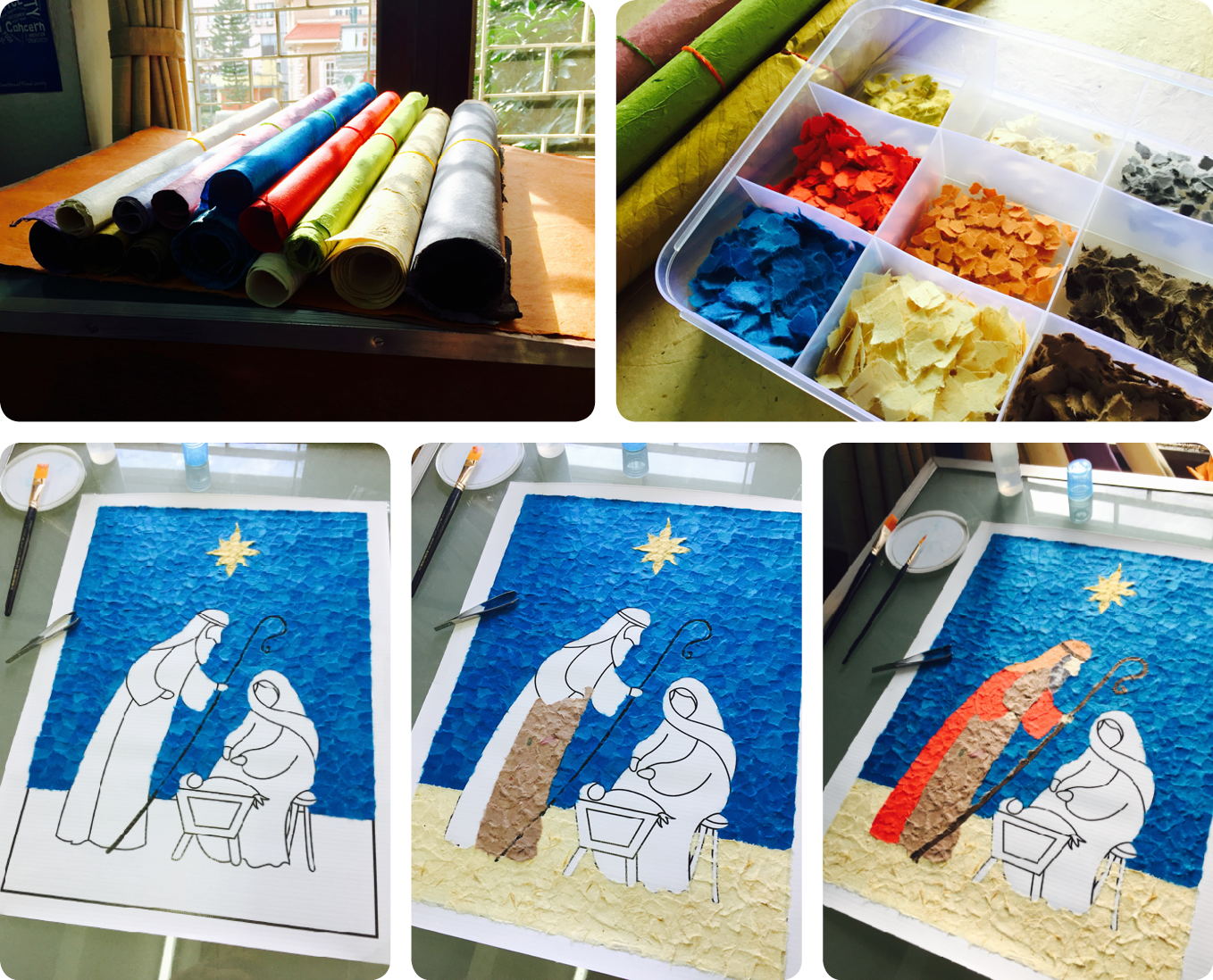
I ended up submitting three pieces. The first piece was a collage made from lots of little bits of torn lokta paper. This was actually something I’d already started when the challenge was set (for the UMN Christmas card). Lokta paper is handmade from the lokta bush which can be found on the southern slopes of Nepal’s Himalayan forests. It’s very strong and durable (meaning the tearing process I went through for this was quite tough!) The earliest surviving lokta paper document appears in Nepal’s National Archives in Kathmandu in the form of the sacred Buddhist text, the Karanya Buha Sutra. The Karanya Buha Sutra was written in Lichchhavi script and block printed on lokta paper and is estimated to be between 1,000 and 1,900 years old.

Feeling guilty about submitting a piece that I’d already started, I decided to have another go. The Dashain holiday started this week in Nepal. It’s the main holiday for Nepali Hindus in the Kathmandu valley. The weather has also changed with monsoon season ending and there is some wind picking up which signals kite flying season for the kids in the valley. I decided to take another sheet of lokta paper and cut a kite from it. I had intended to use the space left in the large sheet to photograph Kathmandu thru it, but this proved difficult for two reasons: The paper wasn’t rigid enough to hold flat (I could have fixed this by attaching a frame maybe), and second the paper was quite opaque when held up. In the end, I fixed the cut-out kite to a window and photographed this.

I was pleased with how it looked, but still felt like I needed to do more. Finally, I decided to use the Himalayan mountain range as my inspiration. Once again using lokta paper, I made an image depicting the vast peaks. Sadly, these days the real mountain range is only visible on particularly clear days in the Kathmandu Valley. When they do make an appearance though, they take your breath away.